Site Dashboards
Navigating through the Site Dashboard
The Site Dashboard serves as the main menu for a building, appearing after you select a desired building from the building cards on the map view. This menu is organized into widgets, each representing a feature of KODE OS filtered for the selected building.
The Site Dashboard and its widgets are fully customizable, allowing you to choose the widgets you want for quick and easy access.
Once your building environment is created you will be able to see all main cards on your left side:
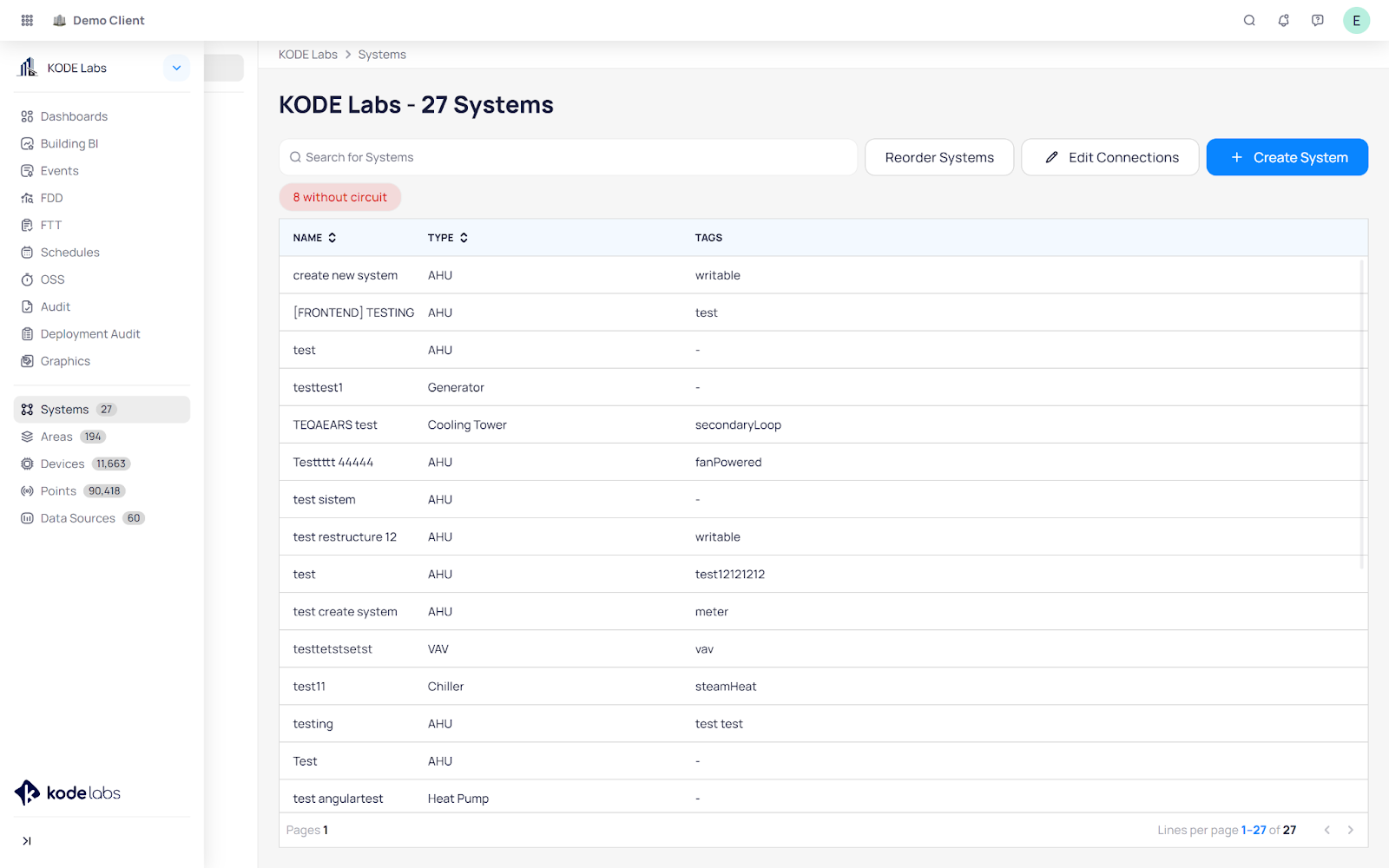
Systems
Clicking on the Systems card will take you to a list of building Systems.
Click on a system of your choice, to view the graphical representation along with devices/points placed on the graphics.
Click on any of the three buttons in the bottom right of the page to change to different views, you can choose between: Circuit View, Dashboard View, and Widget View.
On the left-hand navigation bar, you will find: System Details - including the name, type, and tags. System Devices - will show you devices included in the system and all of their points.
Attachments - gives you the ability to add notes, documents, and attachments within the system details.
Edit System - gives you the ability to change the System's name, type, and tags.
Edit Content - gives you the ability to change the System's devices and points by selecting the ones of your choice.
Delete System - gives you the ability to delete the system you are viewing. Follow the Systems article to learn more details.
Areas
Clicking on the Areas card will take you to a list of all Areas in the building.
Click on any Area (Floor) of your choice and you will be able to view and edit the floor plan graphics and device placement. Follow the Areas article to learn more details.
Devices
Click on the Devices card will take you to a list of all devices in the building.
Click on the filters button to filter the device list by: status, type, area, data sources, origin type, and points count.
Click on the three dots button, which will show you a menu of a number of different actions:
Devices Batch Update - gives you the ability to batch update different device information, by selecting the devices and then choosing a: type, area, tag, location, or reference. It also gives you the ability to select a number of devices and click on Points Apply template to continue to template them all at once.
Points Batch Update - gives you the ability to batch update different point information, by selecting the points and then choosing a: display name, unit, tags, writability, COV tolerance, or precision.
Virtual Devices - gives you the ability to create virtual devices with points coming from different
PseudoDevices.
In order for you to be able to pull points from a device, you need to add the PseudoDevice tag to it, which will populate it into the Devices section within Virtual Devices.
To create a new virtual device click on the plus (+) button, at the top of the Virtual Devices list.
Once you have created your new virtual devices, select a PseudoDevice, select its points from the Device Points section, click on your Virtual Device and then click on Move to move the points to the Virtual Device.
Linked Devices - gives you the ability to link devices from KODE OS with devices in myMSI. Read more in our Device Linking KODE OS - myMSI article. Follow the Devices article to learn more details.
Points
Clicking on the Points card will take you to a list of all points in the building.
Click on the three dots button which will show you a menu of different actions:
Write Multiple Points - gives you the ability to write multiple points. Once you click on it, click on the checkboxes on the far right of the points section, and click on Write. This will open up a window giving you the ability to command the point.
Points - Batch Update - gives you the ability to batch update different point information, by selecting the points and then choosing a: display name, unit, tags, writability, COV tolerance, or precision. Follow the Points article to learn more details.
Data Sources
Clicking on the Data Sources card will take you to a list of all data sources in the building.
Click on the Add Data Source button to add a new data source, and follow our Adding a new Data Source article to learn more.
Click on the three dots button which will show you a menu of a number of different actions:
Test Connection - gives you the ability to check the connection of your data sources. Clicking on it will instantly check the connection, and show a green checkmark next to devices with a good connection or a red exclamation mark next to devices that do not have a connection.
Discover Devices - gives you the ability to discover new devices/points into the platform, follow our Discovering Devices article to learn more.
Refresh Cache - refreshes the cache of the selected data sources from the selection menu, which opens up.
Clicking on the API Catalog in the next tab, shows a list of all APIs which are integrated within KODE OS. You can click on any of them to get more information and proceed to add the data source of that specific API.
These are all native widgets, and the only ones that you will not have permission to move around.
Every other widget is optional and can be arranged to your liking, per the steps below. By clicking on the three dots on the top right corner, you will have the ability to:
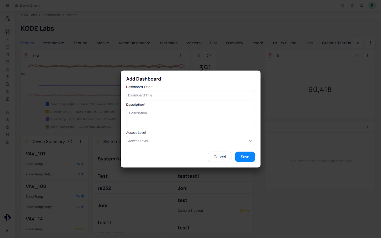
Add Dashboard
By clicking on this option, you will be able to add a completely new dashboard, which will live in a tab next to the overview (main) dashboard. In order to add the new dashboard, you need to give it a title, description, and set the access level to decide what type of user in the platform you want to give access to view that dashboard.
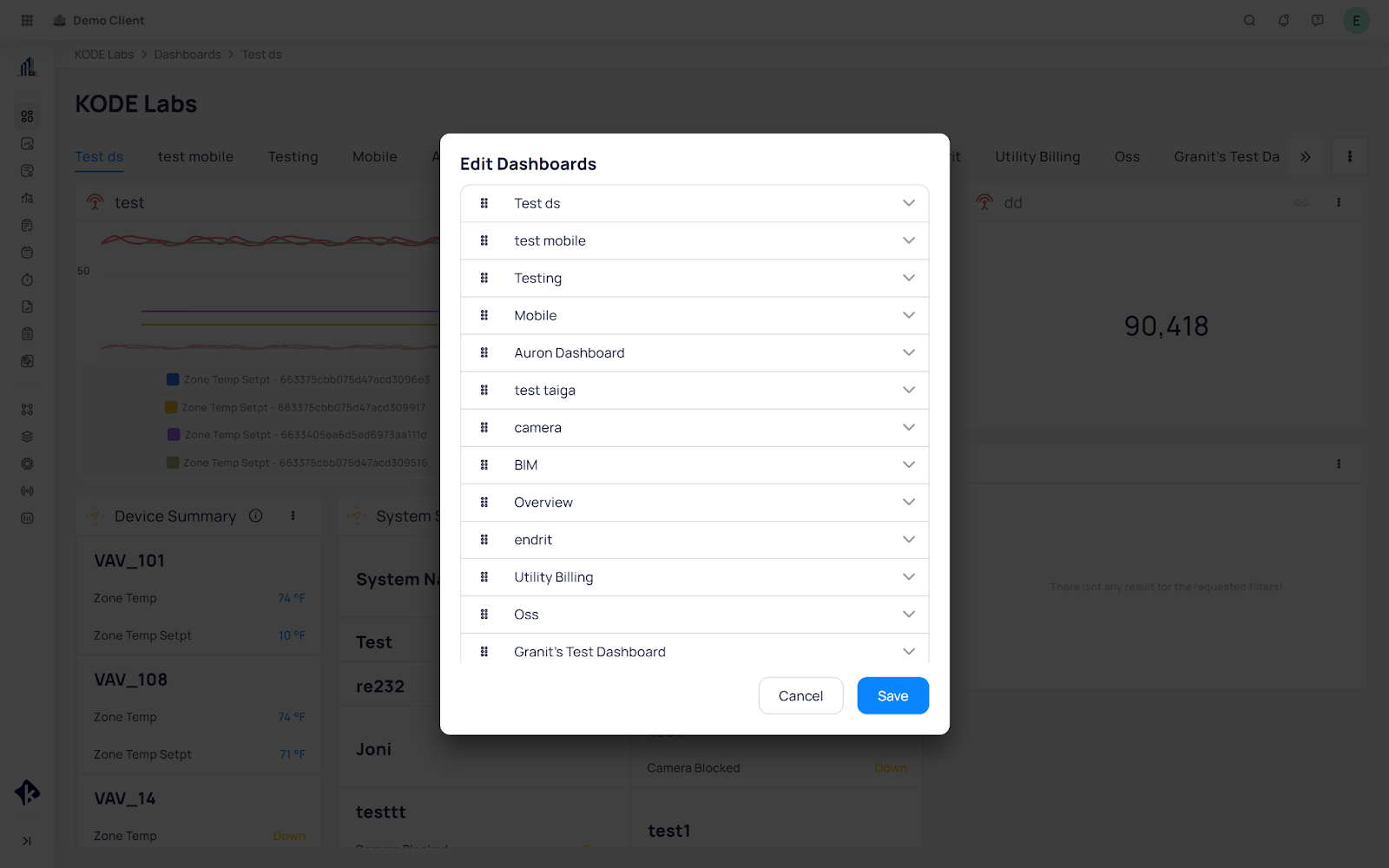
Arrange Dashboards
By clicking on this option you are able to arrange the placement in line of these dashboards. By clicking on the square of dots next to the name of the dashboard, as seen on the screenshot below, you are able to move the dashboard tabs to your liking.
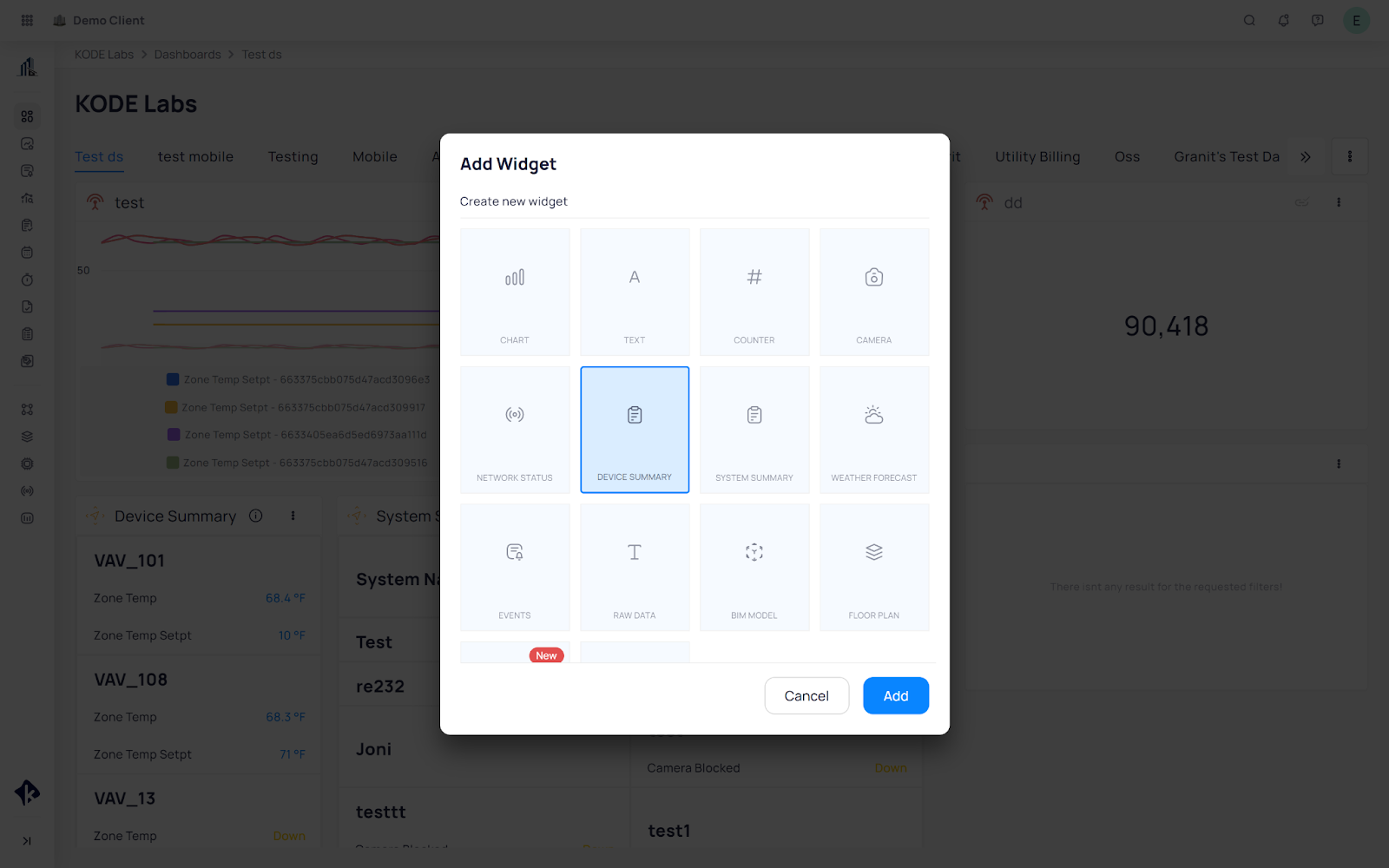
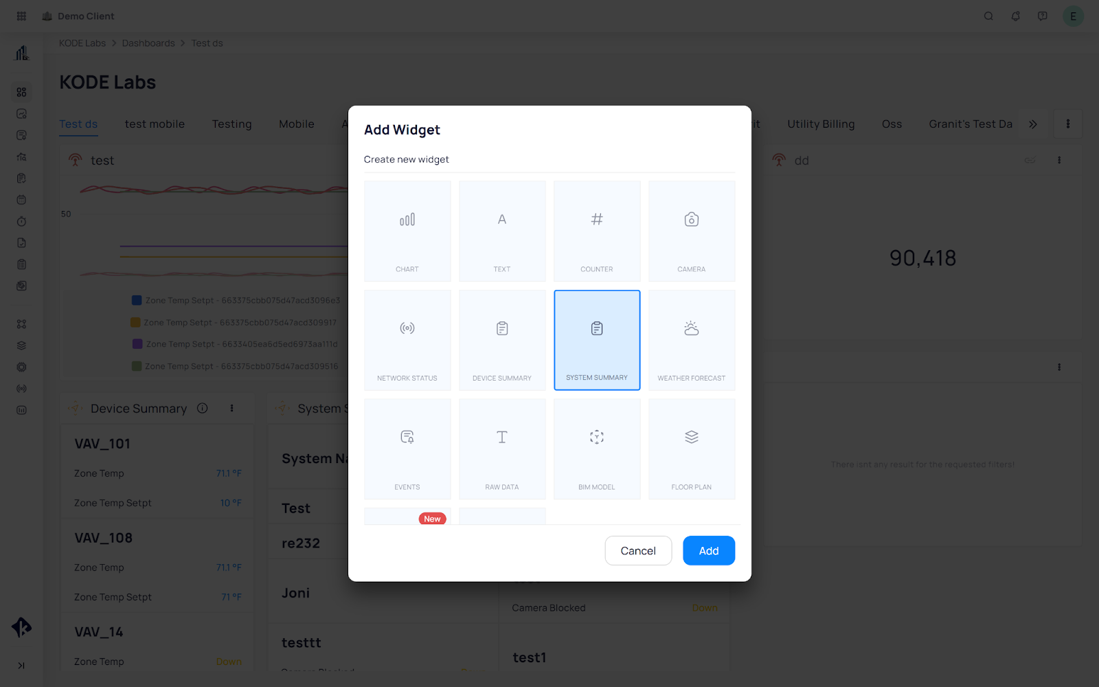
Add Widgets
The add widgets option opens up a menu of various widget options, as seen in the screenshot below.
Arrange Widgets
By clicking on this option, you will be able to place and resize the added widgets to your liking.
Delete Dashboard
Customizing Dashboard Widgets
You can customize the Dashboards to suit your preferences, allowing you to add various widgets for quick access to the information you need, all from a single view. Below, you’ll find instructions on how to add and modify some of the most commonly used widgets.
Device Summary
The device summary widget allows you to add a quick link and key points from devices right to your home screen. Most often used for major pieces of equipment such as boilers and chillers, it provides operational information at a glance.
To configure a Device Summary widget:
Navigate to the Dashboard and click on the 3 dots button on the top right corner.
Select Add Widget from the drop-down menu that appears.
Select the Device Summary Widget and click on Add.
The Card Configurator will open up, where you can give this widget a name, description, and label. You can also make this widget available on mobile or not by clicking on the Display on Mobile checkbox.

Once you click on Next, use Base Filters to narrow down the type of device and type of points that you want to display.
On the same page, use Fields to select the point values.
Use Devices to select the device you wish to place on the Device Summary Widget.
System Summary
The system summary widget allows you to add a quick link and key points from systems right to your home screen.
To Configure a System Summary widget:
Navigate to the Dashboard and click on the 3 dots button on the top right corner.
Select Add Widget from the drop down menu that appears.
Select System Summary Widget and click on Add.
The Card Configurator will open up where you can give this widget a name, description and label. You can also make this widget available on mobile or not by clicking on the Display on Mobile checkbox.
Once you click on Next, use Base Filters to narrow down the type of system and type of points that you want to display.
On the same page, use Fields to select the point values of the system you wish to place on the system summary.
Network Status Widget
The Network Status widget shows whether your equipment is communicating with KODE OS. Although it's
typically configured to display the status for the entire building, you can further filter the widget to focus on
the specific types of devices most relevant to your workflow.
Navigate to the Dashboard and click on the 3 dots button on the top right corner.
Select Add Widget from the drop down menu that appears.
Select Network Status and click on Add
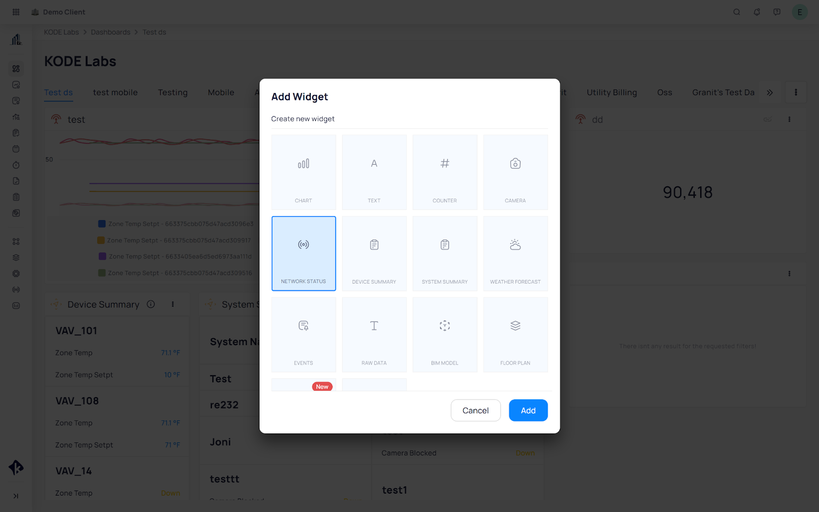
The Card Configurator will open up where you can give this widget a name, description and label. You can as well make this widget available on mobile or not by clicking on the Display on Mobile checkbox.
Apply Base Filters if you want to narrow down your network status widget.
Event Overview Widget
The Event Overview widget provides a quick summary of all events in your building. It gives you the
opportunity to choose different fields based on devices, status, type, start time etc.
Navigate to the Dashboard and click on the 3 dots button on the top right corner.
Select Add Widget from the drop down menu that appears.
Select Events and click on Add.
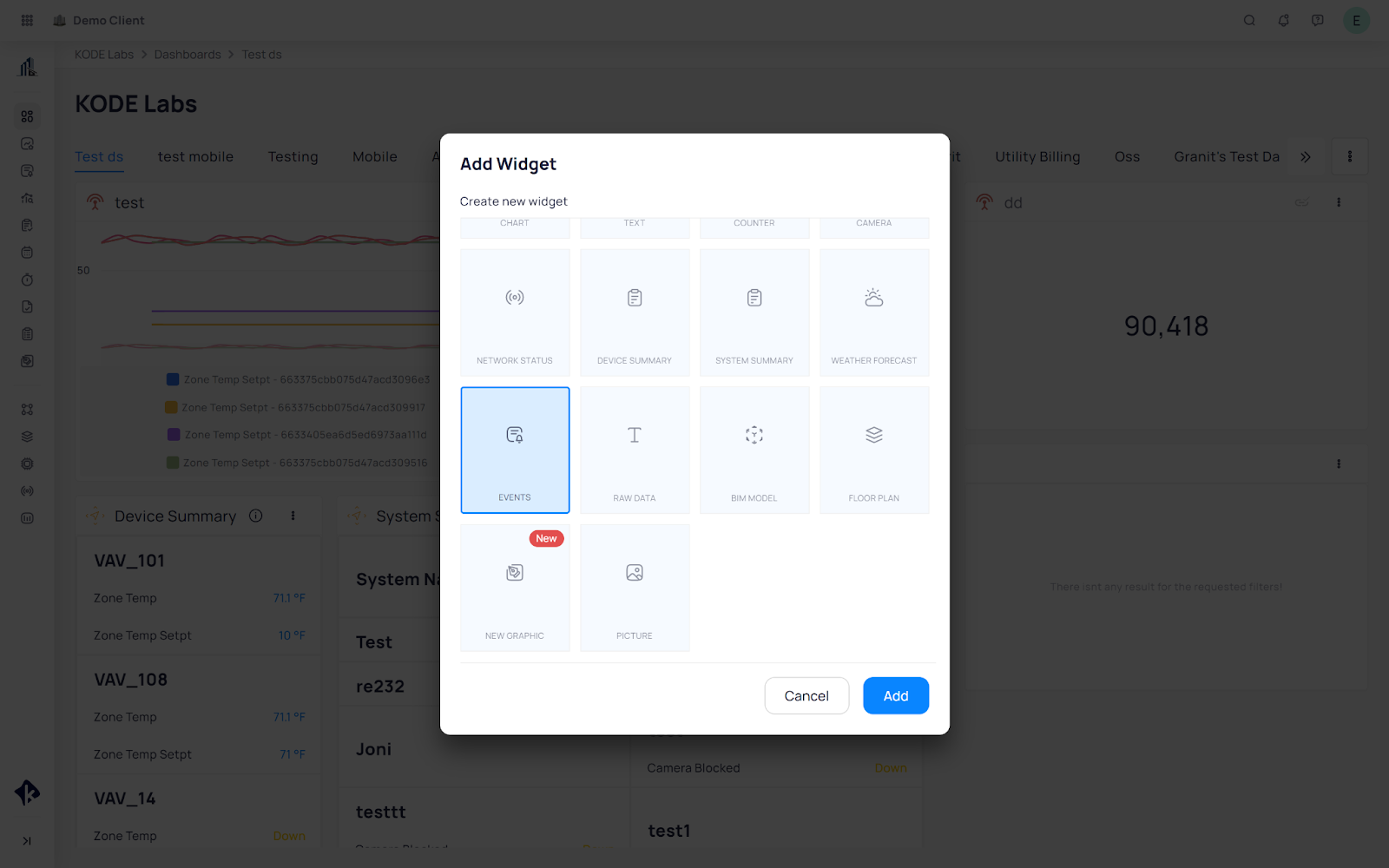
The Card Configurator will open up where you can give this widget a name, description and label. You can as well make this widget available on mobile or not by clicking on the Display on Mobile checkbox.
Apply filters such as Status, Priority, Event Class, Types, Acknowledged, Area, Devices according to your liking.
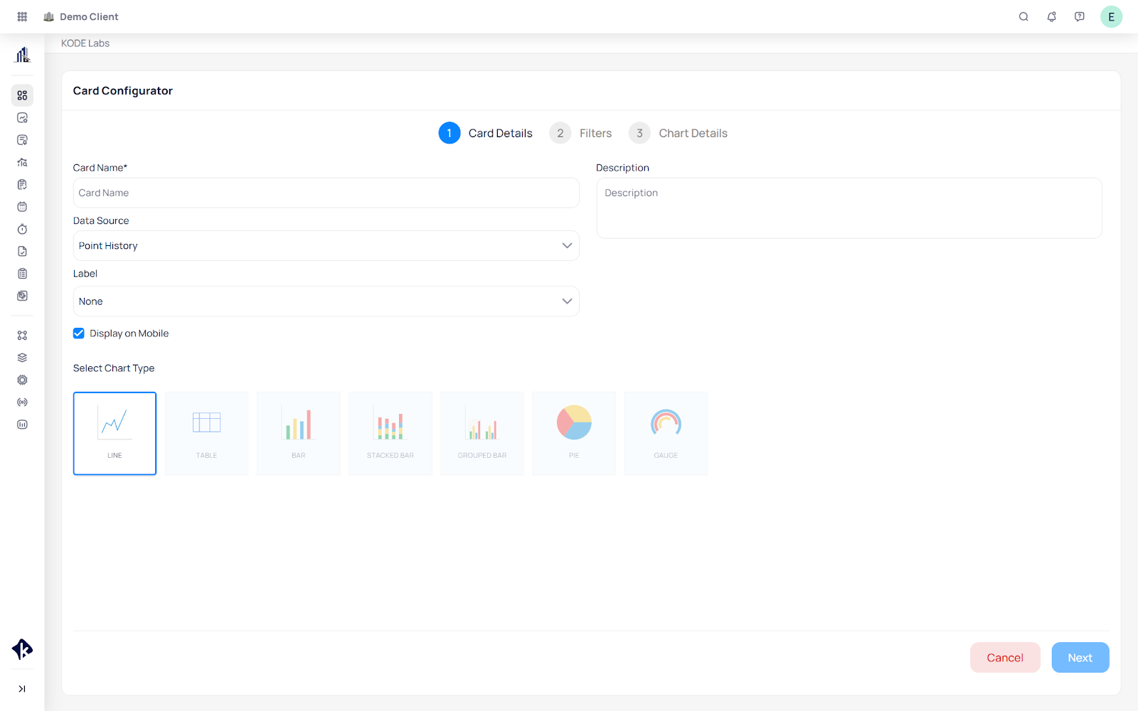
Chart Widget
Navigate to the Dashboard and click on the 3 dots button on the top right corner.
Select Add Widget from the drop down menu that appears.
Select Chart and click on Add.
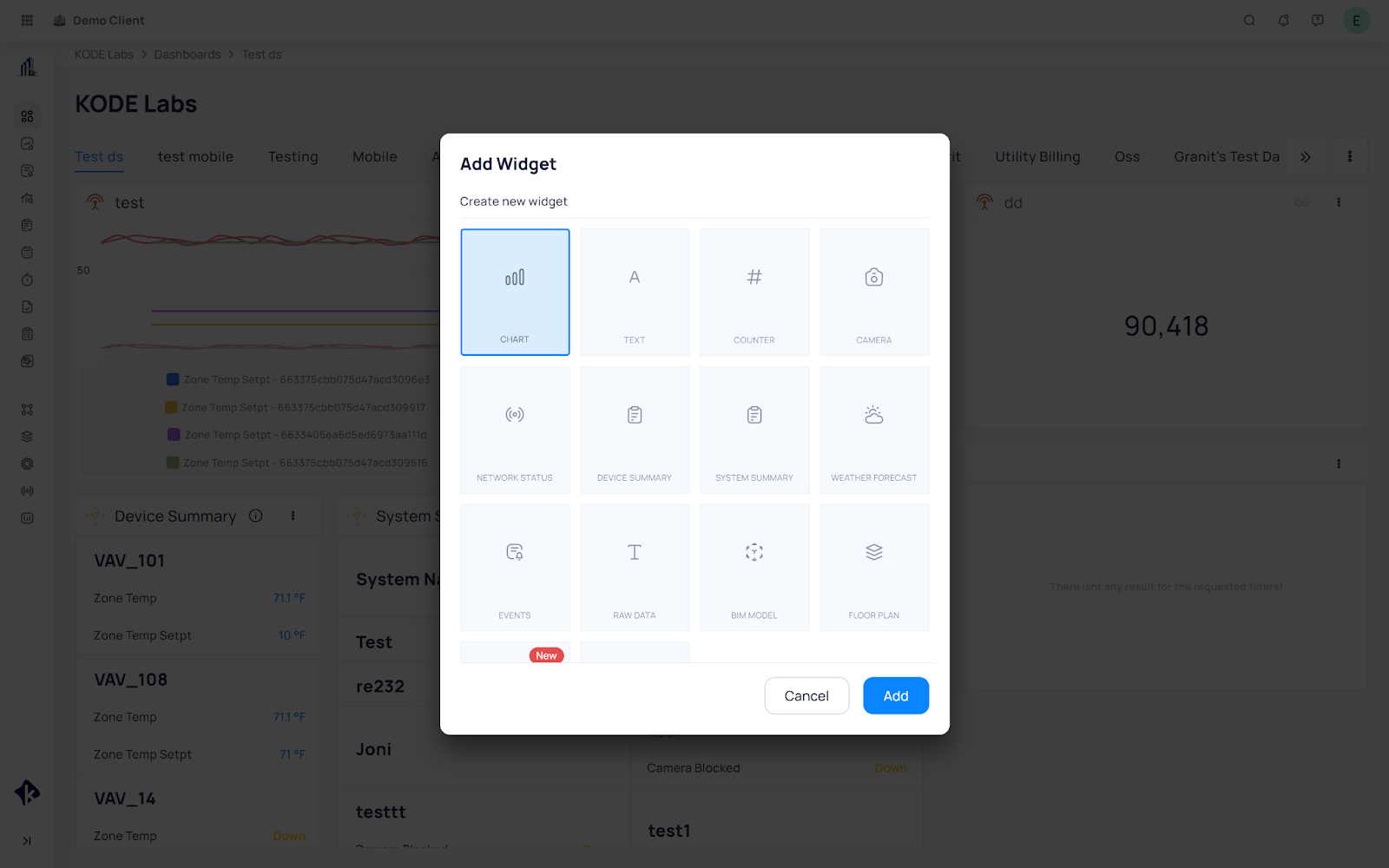
The Card Configurator will open up where you can give this widget a name, description and label. You can as well make this widget available on mobile or not by clicking on the Display on Mobile checkbox.
While on the Card Details phase you are able to choose the data source and the chart type as seen on the screenshot below.
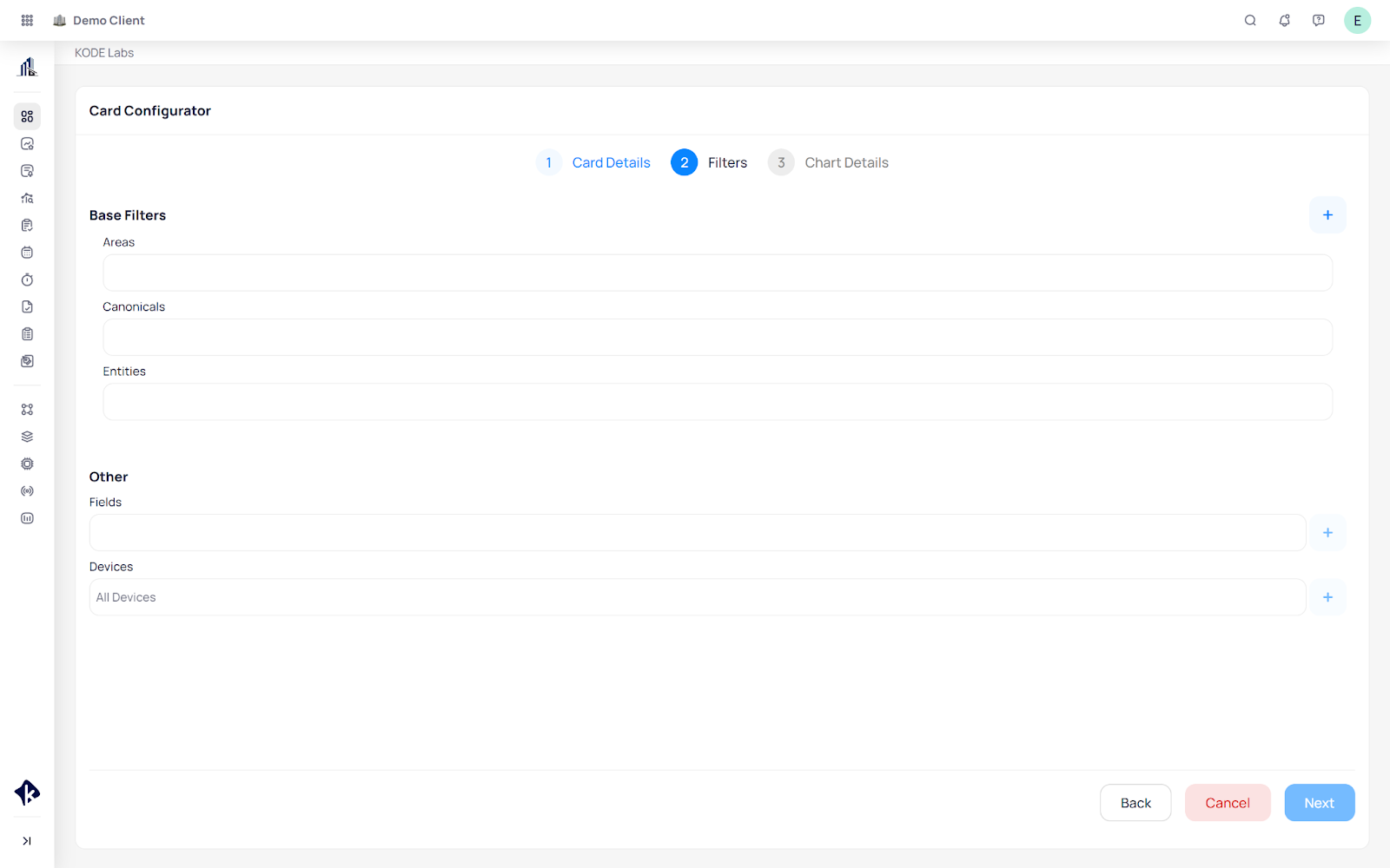
In the Filters section, based on the type you choose you will then have to apply the filters choosing which devices, points, and data in general that you want to see on the chart.
In the Chart Details section you will be able to see a preview of the chart you’re creating as well as choose a number of other filters as seen below.
Other Widgets
The dashboards offer a number of other widgets that can be added. These widgets include:
Text Widgets
The text widget is used to add text into the dashboard. The text can be a further elaboration of another widget, it can be insights into the building, or notes that you choose to write to your liking.
Adding it takes two steps:
Select Text from the Add Widget window.
Insert the Name, Label and Text on the Add Text window, and save.
Picture Widget
The picture widget is used to upload any picture on the dashboard. This picture is usually the building picture but it can be used to your liking.
Adding it takes two steps:
Select Picture from the Add Widget window
Click on Choose Image and choose the picture you want to upload, and save.
Counter Widget
The counter widget is used to count the number of devices, points and others, based on the data source you select.
To add it follow the below steps:
Select Counter from the Add Widget Window
Insert a name, description, label and data source. You can as well make this widget available on mobile or not by clicking on the Display on Mobile checkbox.
Apply the filters based on the data source you chose to count, and save.
Weather Widget
The weather widget is used to show the daily and weekly weather in the location of your building.
To add it follow the below steps:
Select Weather Forecast from the Add Widget Window
Insert a name, description and label. You can as well make this widget available on mobile or not by clicking on the Display on Mobile checkbox.
Click on chart details for an overview and save.
Camera Widget
The camera widget is used to show camera feeds throughout the building.
It also allows you to embed any link of your choice as well.
To add it follow the below steps:
Select Camera from the Add Widget Window
Choose a camera type from the dropdown menu.
Insert a name, description and label. You can also make this widget available on mobile or not by clicking on the Display on Mobile checkbox.
Click on next, to go to the Filters Section.
Depending on the type, insert the listed information.
Uri
Insert the camera link.
Enter the authorization key.
Choose content type.
iFrameInsert any link of your choice.
Device
Select the data source the device is coming from.
Select the camera of your choice.
Click on Chart Details or Next for an overview and Save.
Raw Data Widget
The Raw Data widget is used to show any type of data coming from different data sources.
To add it follow the below steps:
Select Raw Data from the Add Widget Window.
Insert a name, data source and label. You can as well make this widget available on mobile or not by clicking on the Display on Mobile checkbox.
Based on the data source you select, a number of entities will be available. Select the one of your choice from the drop down menu.
Click on next, to go to the Filters Section. The filter section includes a number of dynamic filters which depend on the Data Source of choice.
Once you have selected the filters click on Next for a preview of the data and save to save your changes.
BIM Widget
The BIM widget is used to show BIM files and models in the Site Dashboard.
To add it follow the below steps:
Select BIM from the Add Widget Window.
Insert a name, and select the 3D Model File from the dropdown provided, which you can upload through:
Admin > Building > Files.
Click on Next to go to the Model labels section, where you can select devices which you would like to add to the model you have uploaded.
Related Articles
Navigating to Site Dashboard - Mobile App
The Site Dashboard is the main menu for a building which is displayed after selecting a desired building from the buildings list on the first view once opening the mobile app, the map view. The dashboard is broken down and organized into widgets ...Shareable Links - Widgets
Users who have access to KODE OS can create a shareable link of the widgets directly from the site homepage dashboards and then share that link with any external users. Creating a shareable link makes it simple to share a widget and its data in an ...FDD Dashboards
Active Events Dashboard The Active Events Dashboard provides a real-time snapshot of any active alarms in the building or portfolio. We will describe each widget on the dashboard, how data is calculated, and the options that you as an end user have. ...Navigating and Customizing Portfolio Dashboards
This functionality empowers users to personalize portfolio dashboards based on specific requirements and the type of data you wish to display. To manage this page, the main button to complete operations is located in the top right corner, which is ...Customize Event Dashboard
You can customize the Event Dashboard to your liking in Settings by clicking the More icon. Customize the Event Dashboard by clicking the More icon on the bottom right of your screen. Click on Customization under the Settings section. An edit view of ...