Historical Events Dashboard
The Historical Events Dashboard provides an overview of any events that have both started and then returned to normal in the building or portfolio. We will describe each widget on the dashboard, how data is calculated, and the options that you as an end user have.
Date Picker, Filtering & Preferences
Starting from the top of the dashboard, the first components that we see are the date picker, choose users, filters, and preferences buttons on the top right.
The default view looks at the last 7 days in the building. Users can view up to 30 days of data at one time. All metrics are computed based on the selected time period.
Choosing User will filter the dashboard to all events assigned to the user. User assignment is done automatically according to a policy and only assigned users can ack an event.
Clicking the Filters button will open a set of dropdown slicers at the top of the page. Here you can choose specific filters to apply to the dashboard, you can also save default filters for yourself or the building and these will apply every time you open the page.
Preferences are user-specific ability to show/hide portions of the dashboard. The most common & compact dashboard view results from applying the following preferences
Show
Building Summary
Routines, Priority, Domain
Table View
Hide
Device Types & Impact
Count & Duration Overview
Assignees
Count & Duration Trend
Operation Daily Overview
Interactive Capabilities
The following actions are available on one or more charts and help translate the dashboard from a summary to an interactive troubleshooting tool.
Hover - When hovering over most widgets, you will be presented with a tooltip describing the underlying data.
Filter with a Click - When viewing most widgets, you will be able to click on a data point and this will automatically apply a filter to the rest of the widgets on the page.
Number Cards
The number cards provide summary statistics regarding the number of active events in the building or portfolio.
The next 4 charts, provide a powerful summary of where, what, priority, and type of issues that are currently active in the building.
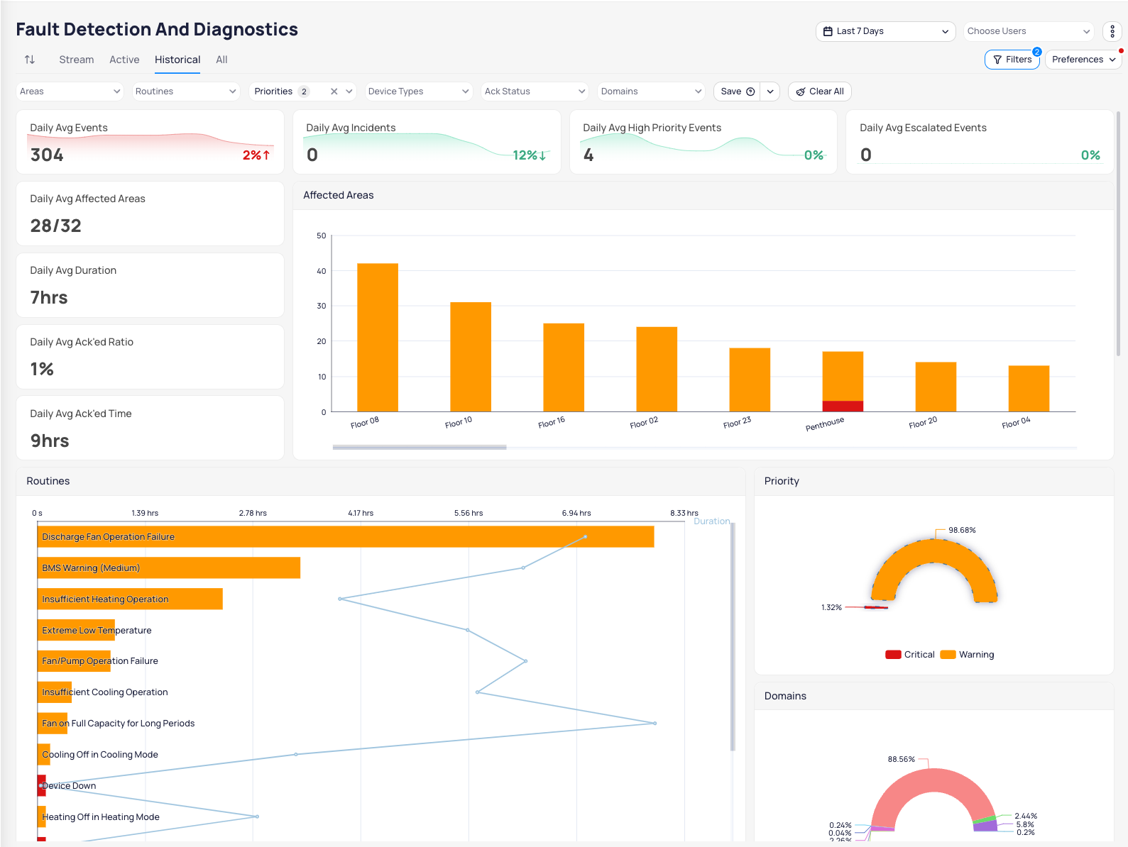
Affected Areas (Bar Chart)
This chart visually indicates what floor is experiencing on average the most # of daily issues. There is a scroll bar on the bottom to see floors that are lower in the ranking. Color coding is based on the priority level of the events.
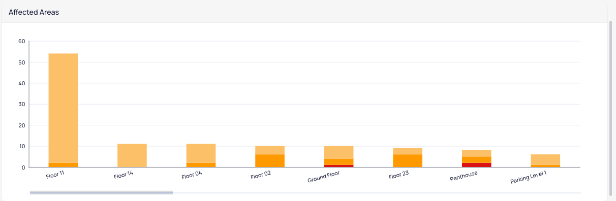
Routines (Bar Chart)
This chart visually indicates both the daily average count and daily average duration of each unique routine (problem). The routine represents each rule used to monitor your equipment. From this chart, you can easily see what problems are most frequently with your equipment and what is most common. There is a vertical scroll bar on the right to navigate to less common routines.
In this chart, the height of the bar indicates the # of events that are active per that routine and the line graph indicates the duration. Generally speaking, both high count and high duration can be used to find common issues. The colors of the bar indicate the priority level of each event.
Priority (Pie Chart)
This simple pie chart breaks down the daily average % of events by priority level. Hover to see exact counts and click to filter the rest of the charts to a particular priority level.

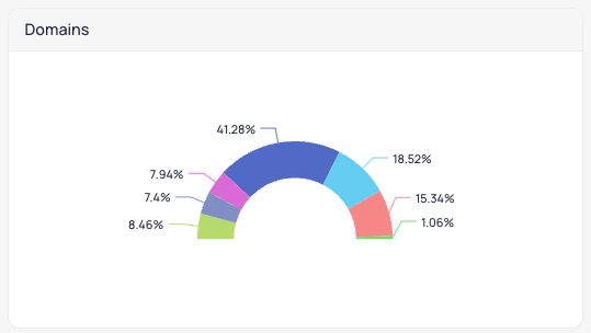
Domains (Pie Chart)
This simple pie chart breaks down the % of daily average events within each domain. Domains are generally high-level categorizations per routine typically indicating heating, cooling, connectivity, and other categories of issues. Hover to see exact counts and click to filter the rest of the charts to a particular domain.
Affected Device Types (Pie Chart)
This simple chart shows you the types of devices that are impacted. Clicking on a specific device type will filter the dashboard. The “other” section indicates there are more device types with such a low count to display on the first layer of the pie chart and you can click “Others” to drill down further and see more.

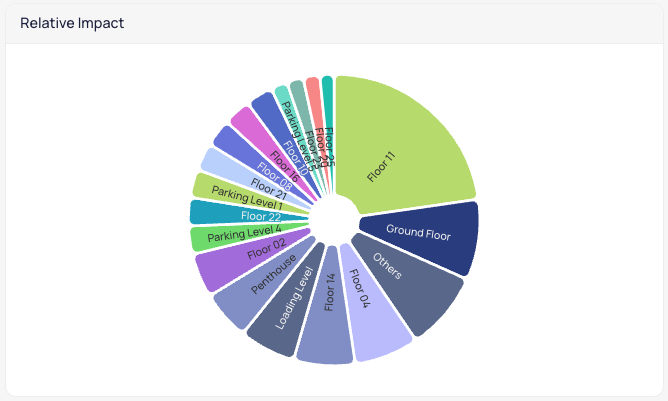
Relative Impact (Pie Chart)
The relative impact chart will order floors by the percentage of devices that are impacted on that floor. I.e. if 10/10 devices are impacted on a floor that will be presented first and bigger than a floor where 25/50 devices are impacted. This chart is view only and not filterable on click.
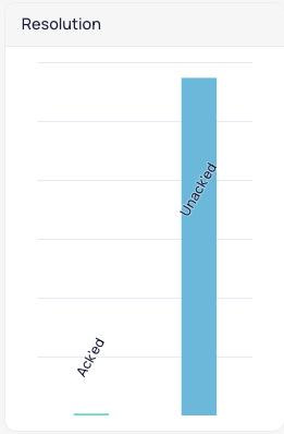
Resolution (Bar Chart)
This chart indicates the % of events that have been acknowledged vs Un’Acked. Allowing users to see at a glance the % of Un’Acked events remaining.
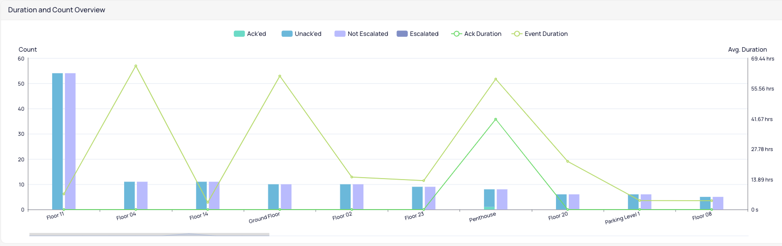
Duration and Count Overview (Combo Chart)
This chart communicates multiple data points. Per floor, you will see the count of events generated, broken down by how many are ack’ed vs unAcked. You will also see this broken down by escalated vs not escalated. This is communicated through the bar charts. The line charts indicated the event duration and average time to acknowledge compared to the event duration.
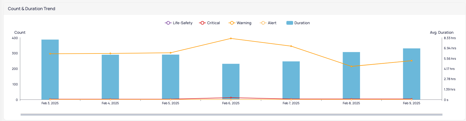
Count & Duration Trend (Combo Chart)
The Count and Duration Trend will show how the average duration trended per day (bar charts) and the breakdown of event count by priority level (line graphs).
Operation Daily Overview
The Operation Daily Overview chart provides a breakdown of total events generated, acknowledged, and escalated per day.
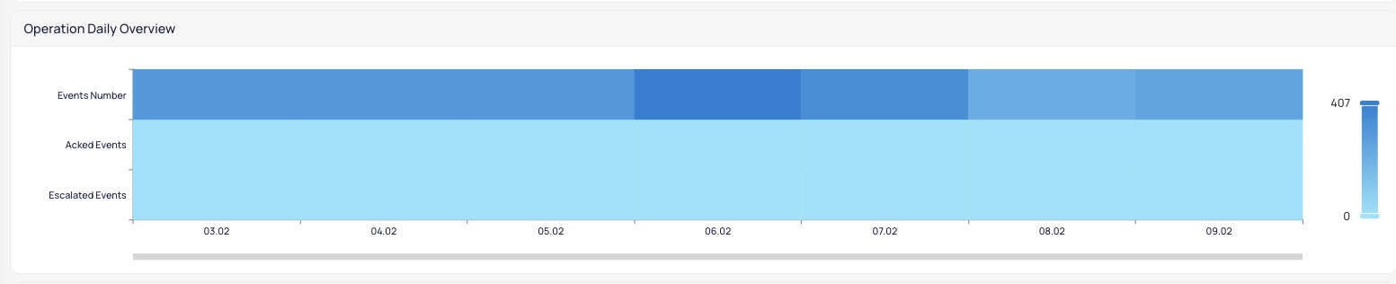
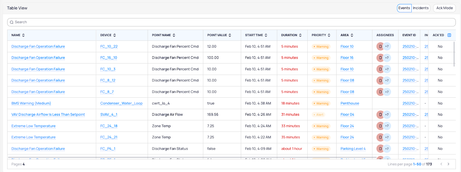
Table View
At the bottom of this page dashboard, you will find the classical table view of all events. This table will be filtered based on any filters applied through the top menu or by clicking on the charts. This table is searchable, can be switched between event view and incident view, and Events can be acknowledged directly by enabling ack mode. Users can show/hide columns (impacts current users only) by using the column organizer button to the right of the “Ack’ed” column.
Assignee Table
The assignee table documents each user who has been automatically assigned to an event, how many incidents they are included on, how many events they have acknowledged, how many escalated because they were not acknowledged fast enough, and the average duration that an event has been open per assignee.
Related Articles
Events Options and Features
KODE OS monitors the operational health of your equipment 24/7 via event routines which cover everything from fan command failures to zone temperature off setpoints. The Events Dashboard is the central location in KODE OS through which you can view ...FDD User Manual
Understanding Fault Detection & Diagnostics What is a Fault? A fault is a period of time in which a specified condition is true on a specific device. For example, this is a fault: @8:00am AHU-1 Could not maintain discharge temperature within setpoint ...FDD on Mobile App
Introduction Fault Detection and Diagnostics (FDD) is a proactive approach for identifying and analyzing system failures or faults within a building's infrastructure at their earliest stages. Navigate through FDD Log into the Mobile App and you’ll ...Event Streaming
The FDD Streaming View provides the classical interface for monitoring building notifications along with a number of preference settings to adjust the view to the needs of the portfolio or user. Highlights Automatic Refresh Streaming comes with an ...FDD Dashboards
Active Events Dashboard The Active Events Dashboard provides a real-time snapshot of any active alarms in the building or portfolio. We will describe each widget on the dashboard, how data is calculated, and the options that you as an end user have. ...