Graphics
What is included
There’s a graphics builder we’ve been cooking that gives you the ability to build System and Device Graphics and customize floor plans with additional functionality that outperforms any other graphic tool in the industry.
Smart Markers - Smart Markers provide for dynamic features and logic to be added to the marker configuration, such as color-coded point ranges, adding greater value within graphics pages..
The rules and ranges of how the marker will get colored are handled in the Settings page
For each marker we can pick a point and a config
Display functionalities:
Icon only - the marker will show as an icon and be colored to reflect its current value
Value only
Icon and the value
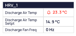
Tables - Easily create a table in a few clicks! Table views that list the points from certain devices can now be included in floor, device and system graphics.
The table is created simply by picking the device and the points we want to show
The table is a single element, so updating or moving it is very simple
The user can pick points from multiple different devices to show on the table
This version only supports two columns, point name and value
Control styling such as colors, column width, font sizes, etc.
The style of all the tables in a graphic can be edited in batch
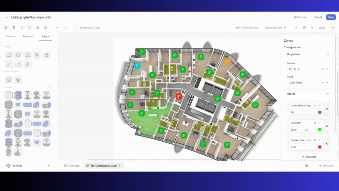
Zone drawings & control - Draw zones, choose which devices will control the zones, and how they will be colored. Now you won’t have to hard code them and you’ll be able to configure everything in the Graphics module.
Pick which devices will control a Zone’s color; only the devices placed within the borders of the zone can be chosen
Pick the point which will control the zone – the common point of all markers on that zone
If the point is boolean/enum
The operator is either AND or OR
AND applies the 'and' operator on all the point values
OR is the same, the 'or' operator is applied
If we want to make the zone color yellow when the light status is On:
“AND” means all the values from all devices on that zone should be On in order for the zone to get yellow color
“OR” means if any of the point values in the zone is On, the zone will get yellow
If the point is number
The operators are AVG, MIN, MAX, SUM, MED
This operator is applied to the point values
So if we want to set a zone as green if the values are between 22C and 24C and apply the AVG operator, then the average value of all the points within that zone has to be within this range
The same applies to other operators
After we pick the operator, we can chose the States
The State determines what color the zone will get based on the point values
For number points we can set ranges or other comparisons such >, <, = etc.
For boolean/enum points we simply pick the values and set the color
Each zone will have a default color which will display if the values do not fall within the State rules
The current version only supports one point reference per zone
Hover-over markers - The “Hover-over” feature allows users to reference multiple points in the marker, but only show one by default. The other points will show when the user hovers over it. This functionality can be used for Smart Markers and default markers. Also, you can hide marker headers or labels and on the hover they will show. When used with Smart Markers, this functionality allows users to see the Device name and navigate to Device Details.
System Markers -System Markers act as links, providing easy navigation between System graphics or from floor-plans to System graphics.
While editing a graphic, the user can switch between Devices and Systems in the left hand Elements menu
All Systems relevant to the site will be there and the user can simply drag and drop the System into the graphic to create system markers
System Drawings - In previous versions, users needed to upload an image that served as the system drawing. Modifying the drawing was impossible. Now with the new tool we can create and modify System drawings within KODE OS:
There is a library of drawing elements which the user can drag and drop to create a System graphic
Drawing elements are single components such as pipes, valves, pumps and other component parts of the system
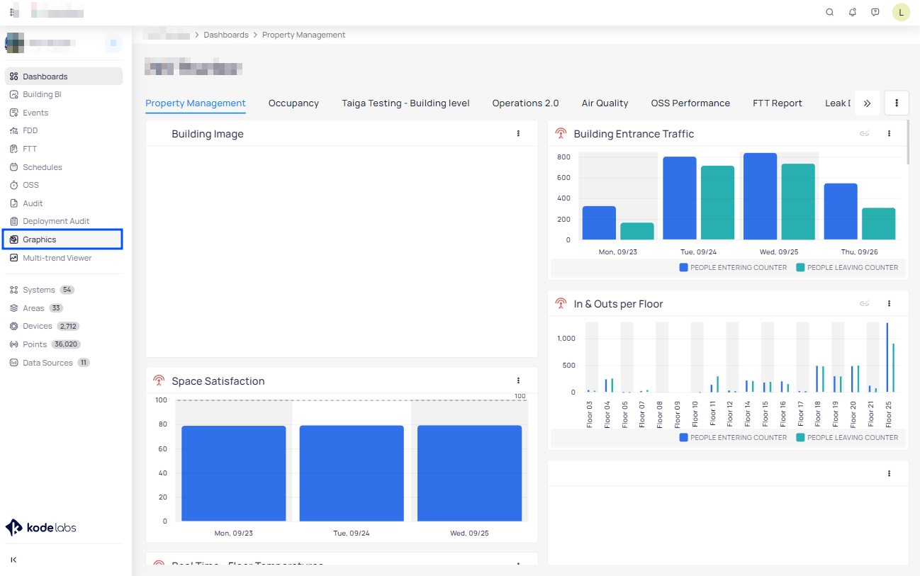
Dragging components onto the graphic canvas will allow the creation of a System drawing
Grouping and other options allow for better usability
Creating a system drawing is separate from putting the markers on it, which can be done as a second step.
System Layers - With the new tool we will be able to add Layers to Systems too. This can make the system graphics better, for example:
The main layer might show only the most important points
The second layer can then have all other points and tables, System Markers linking to related systems, etc.
Effective use of System Layers will create a better user experience because the main layer won’t be overloaded with too much information.
Layer Configurations - Users are not limited when adding layers, and can create any layer they may want. To speed the process even more users can create layer configurations in the Settings page.
Layer configurations will serve the purpose of:Keeping consistency
Making the placement faster because we don’t need to pick the points, just the drop the devices on the view and points will show up according to the configuration
Layer configuration includes:
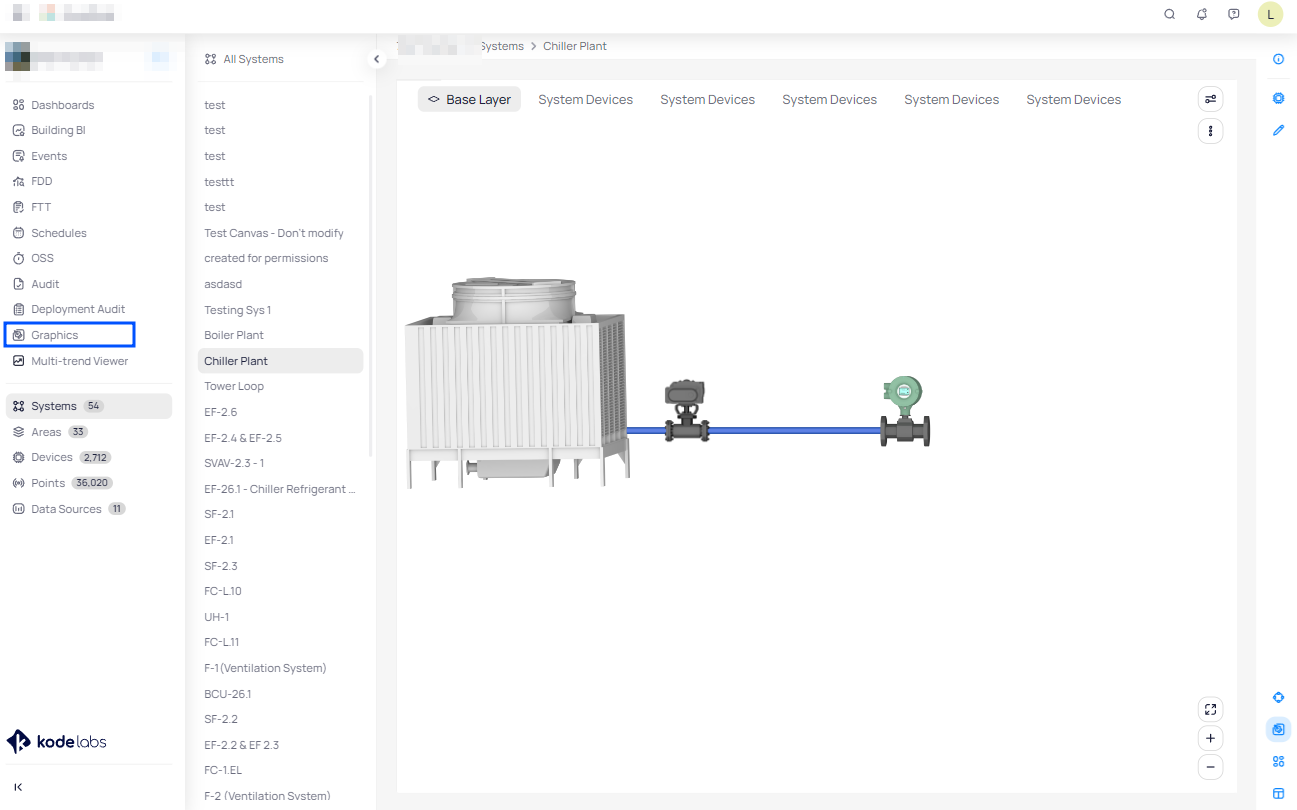
Name
Name of the layer, which can be changed on the graphic
Icon
The icon that will show up as the layer icon
Device type
Serves the purpose of filtering the devices while doing placements
Point field
Selected point(s) will show up when we drop a device on the graphic
So no need to expand the device and pick the point, we just drop the device and the point shows up
Smart marker
If we want for the markers to show up as smart markers, we choose a configuration of the Smart Marker
Smart Marker will show up if the selected point is available on the marker
Easy batch editing/moving/deleting - Simply batch-select the markers by dragging the mouse or clicking on them, and perform batch updates to the marker properties. It is no longer needed to edit the markers one by one. This will save a lot of time on floor plan or system configuration.
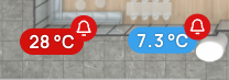
Show points statuses and states - Now the markers will highlight if the points have alarms or other states and statuses such as:
Alarm
Down
Fault
Stale
Overridden
The state will be represented by a color and an icon next to the point value. This icon will be enabled by default on smart icons.
Elements alignment - This will allow you to align multiple selected elements on graphics with ease. Options that you have available:
Left
Middle vertically
Right
Top
Middle horizontal
Bottom
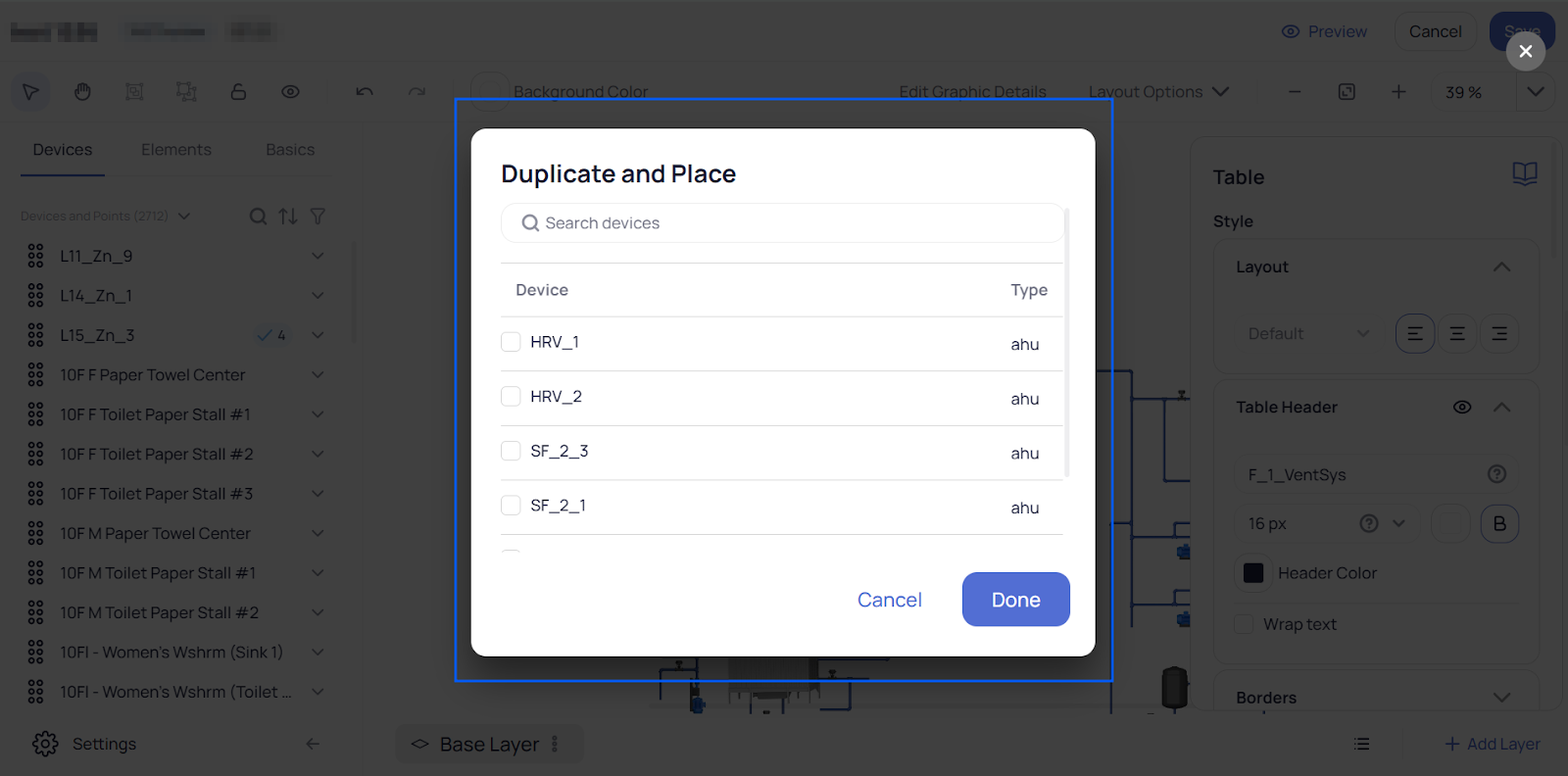
Duplicate and Change Device - Here you can select a table or smart marker and duplicate it in order to create multiple tables or smart markers in a faster and easier way. After you complete creating a table or marker for a device or system simply right click on it and proceed to Duplicate and Place.
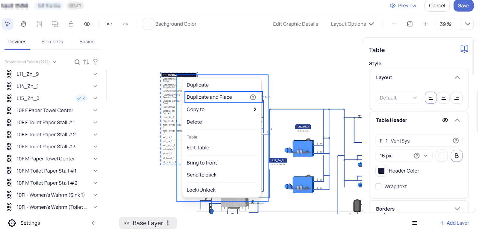
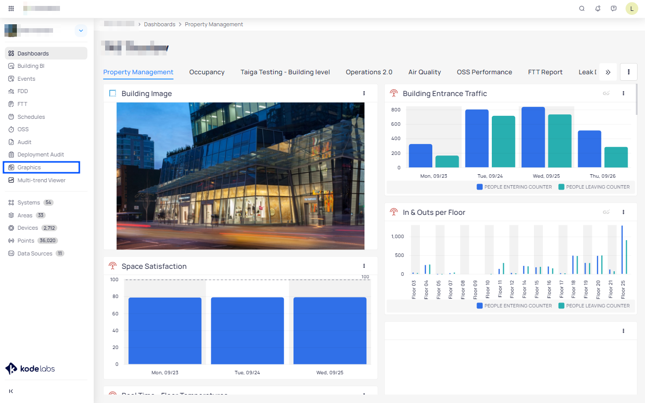
After clicking on it a new dialog will be opened with all the devices listed that are of the same type as the original one where the table or smart icon belongs. Here you can choose multiple devices if you want to create a similar table or smart icon with the same style and configuration as the selected one.
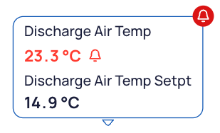
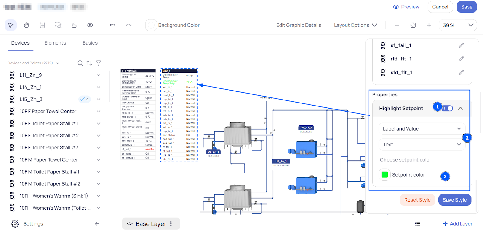
Highlighting the setpoint value - You can highlight a wanted setpoint of your choice in order to make it more visible in a graphic manner. Simply click on the marker or on the table you want and enable the “Highlight Setpoint” option and here you can also choose if you want to highlight the “Point Label” or “Point Value”, or why not to highlight them both by selecting the “Label and Value” from the dropdown menu. You can add here a small icon before the name of the point and the value to make it more notable from the other rows so you can choose if you want to highlight the text with the value or adding this icon.
Also do not forget to choose the color!
Crop the drawings - Now you have the ability to crop the drawings you uploaded or the elements from our library (excluding images added as a background such as floorplans or built up systems and devices). Simply when an object is selected you can go on the right side of the menu at the Shapes and choose the Crop option:
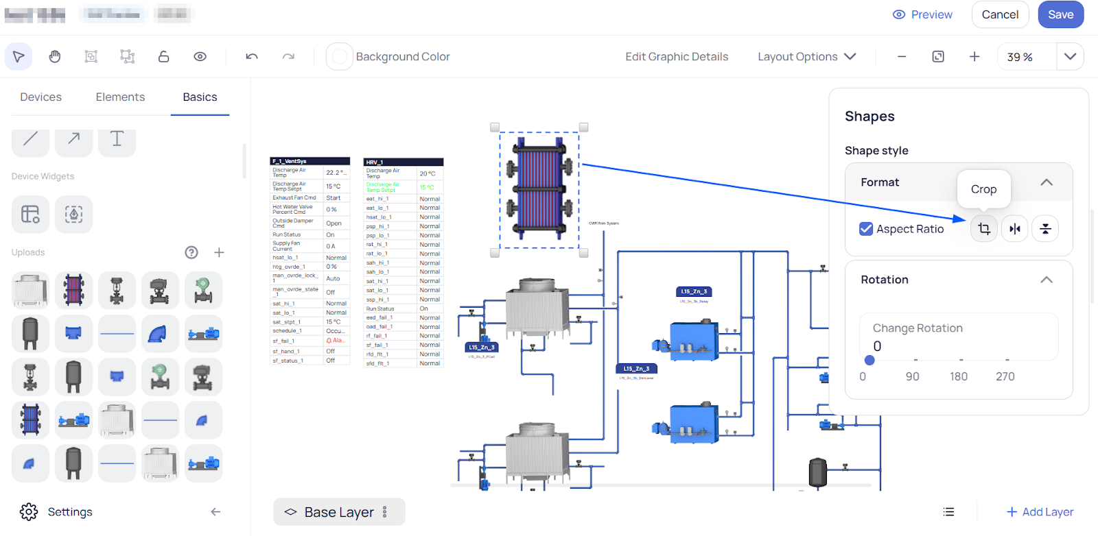
Click on it and the drawing or selected object will visually change to reflect that it is in a “cut” state.
Adjust the black circles to perform cutting. Hit “Enter” and there will be shown the left object after the crop.
Module summary
We’re thrilled to announce that Graphics creation as we know it has been completely transformed. There’s a graphics builder we’ve been cooking that gives you the ability to build System and Device Graphics and customize floor plans with additional functionality that outperforms any other graphic tool in the industry. Tailored by the feedback given from our community of system integrators, this has been designed to deliver faster and more scalable deployments, while also automating repetitive processes such as updating markers, creating tables, and layer configuration
Graphics is an in-house creation space to create System & Device Graphics, and customize floor plans without having to leave KODE OS - it wouldn't be called a single pane of glass otherwise, would it?
We’ve created Graphics for three key reasons:
In-house graphics creation: Create your graphics and edit them whenever you need to on your own terms. In-house tools, in-house rules - we have full control over the functionalities of our Graphics. This also means that your feedback is invaluable to advance this in the future.
Faster deployments: With functionalities like batch marker editing, layer configuration, and table creation, you cut down the number of clicks you need in order to make the edits. Configuring a floor plan or a system is a breeze now.
Offer more value: Along with all the cool updates to make the deployment of graphics faster and scalable, Graphics introduces features that your users will love - Smart Markers, Zone Drawing, Tables. Smart markers will indicate their values by their colors - users will be able to understand if everything is performing at their peak performance in one glance. In the next few months after we transition, users will be able to drag and draw zones directly on the floor plans so they can indicate different tenant spaces. Last but not least, building operators are huge fans of tables next to their system graphics - they can easily drop all the different points they need to know about how the system is operating, is there any alarm in place, and any system key and system parameters. Again, all this is self-service.
Navigating and using the Graphics module
You can use the KODE OS Graphics module to create or modify Area (floor plan), Device and System graphics.
In this article, you will be guided through how to use the Graphics module to create or modify graphics for each of these three cases.
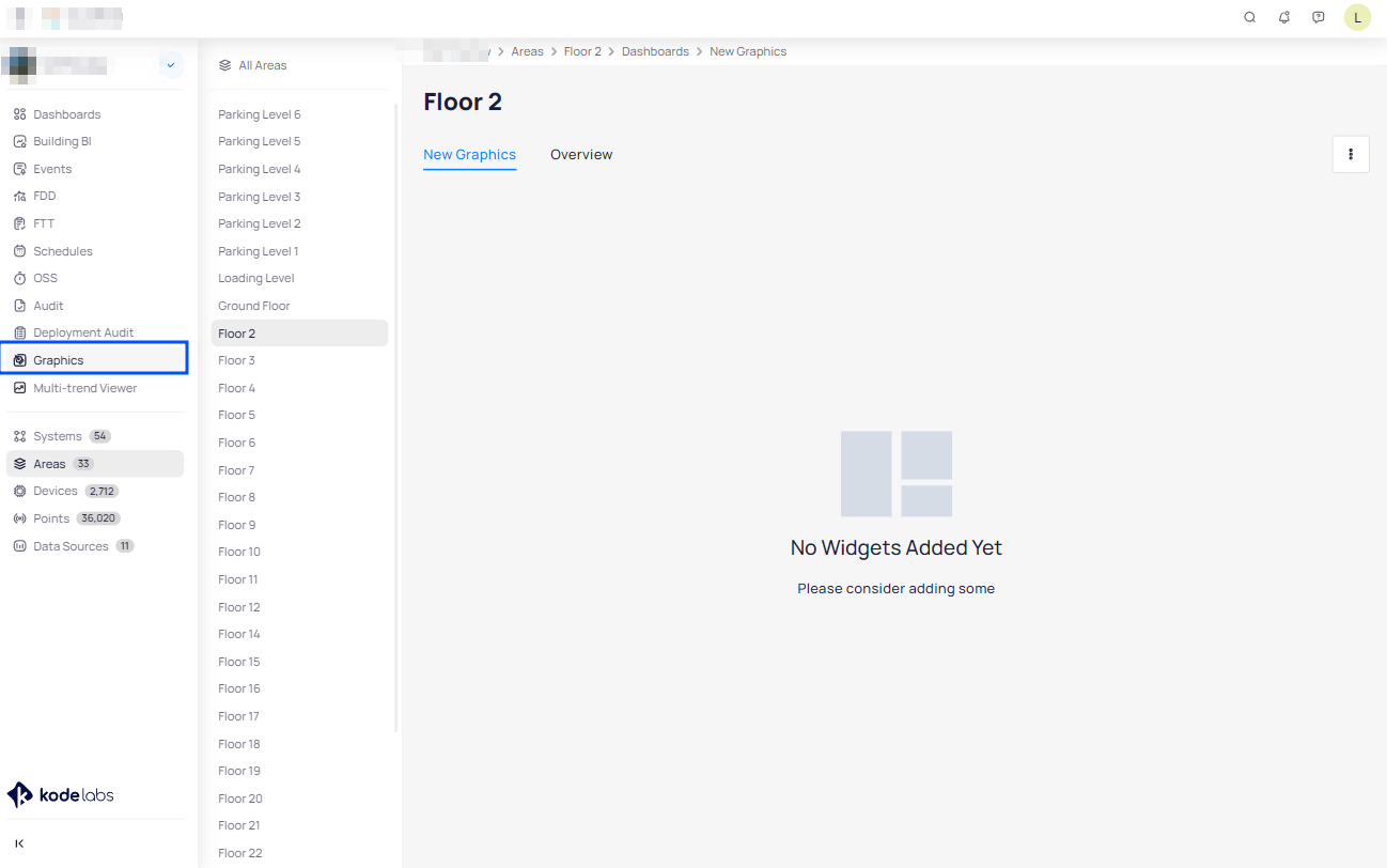
Accessing the Graphics module
The Graphics module is a permission-based component of the KODE OS platform. Users authorized to create and/or modify graphics can access the Graphics module in two ways:
You can find it by selecting the building of your choice.
From the main left side bar select “Graphics Tool”.
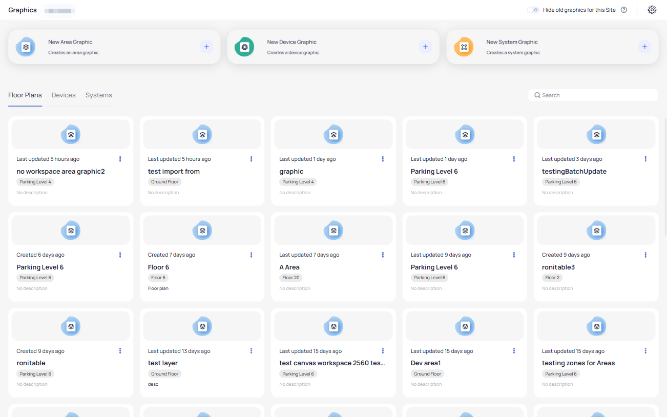
If you choose this way the new graphic tool will be opened on a new tab and there you will be presented with the homepage of the tool. Here you can select to create a “New Area Graphic”, “New Device Graphic” and “New System Graphics”. Also here you will find all graphics created, from where you can edit them, duplicate or manage them as per your needs.
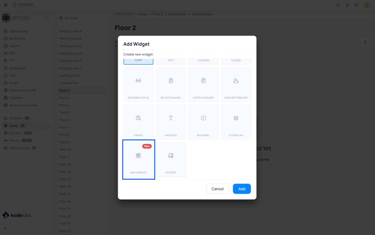
Specifically for adding Area or floor plan graphics, the Graphics module can be accessed from the Area itself:
Go to the building of your choice.
Select an Area.
Click on the 3 dots icon at the top right corner of the Dashboard.
From the dropdown menu select "Add Widgets".
Select "New Graphic" widget.
Area Graphics
To create an Area graphic, if you start from an Area, and select “New Graphic” widget, you will see the following prompt:
After this the system will pop up a window asking you (if there are any previously graphic files found for the selected area) to choose which one to add, or you have an option to Create the new one:
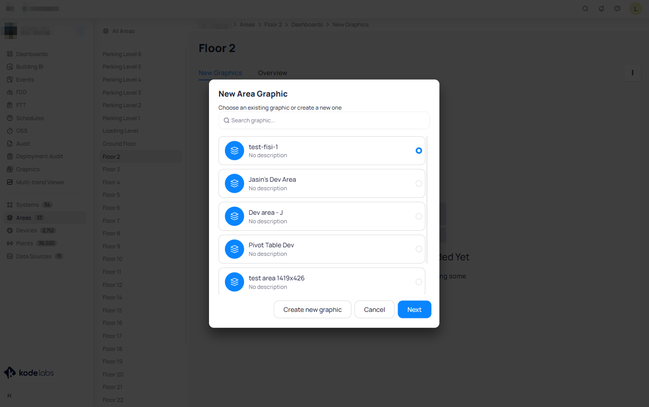
If you choose to create a New Area Graphic this will be automatically associated with the Area you are within and will ask you for a Name.
You can “Browse Files” and add a file directly from your PC.
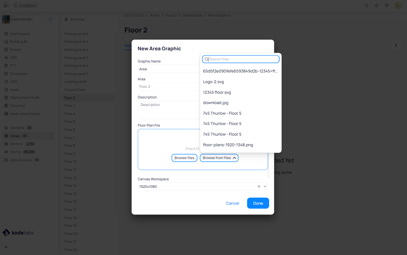
Alternatively, you can start from the Graphic module, and select New Area Graphic which will bring you to this screen
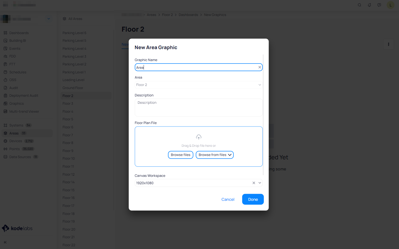
Here you select the Area and the floor plan file to upload.
You can also “Browse from files” where there will be shown a list with the previously uploaded files.
Completing either of these two methods will take you to the Graphics module opened in a new tab. From this interface, you will have the tools and options needed to create custom graphics with ease.
Now that you have selected a graphic or created a new one let’s see how to interact with the features and options in the KODE OS Graphics module.
Graphic Enhancement Features
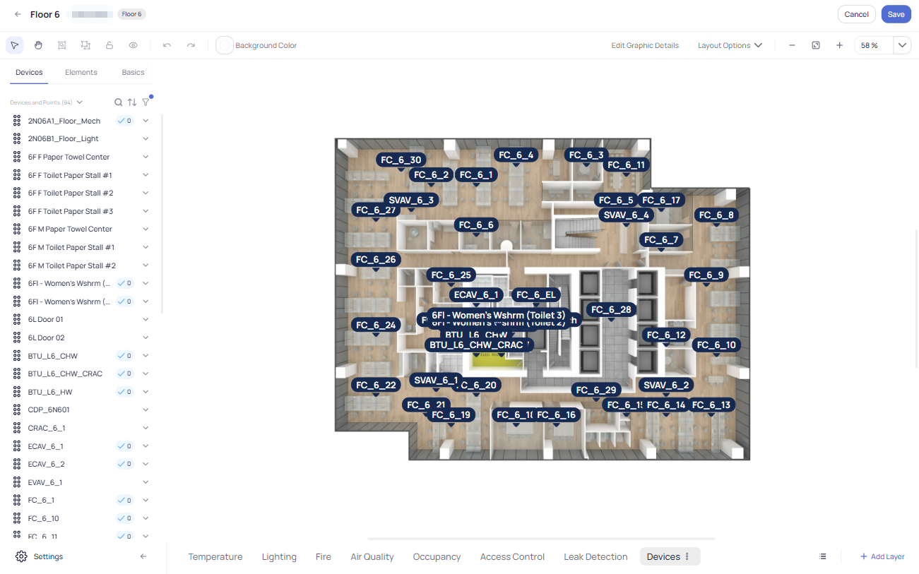
On the left side of the floor plan edit mode there is a list of Devices which you can drag and drop onto the floor plan. Also, you can use filters to select proper devices based on what purpose you want your graphic to serve.
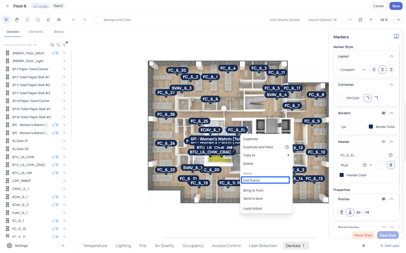
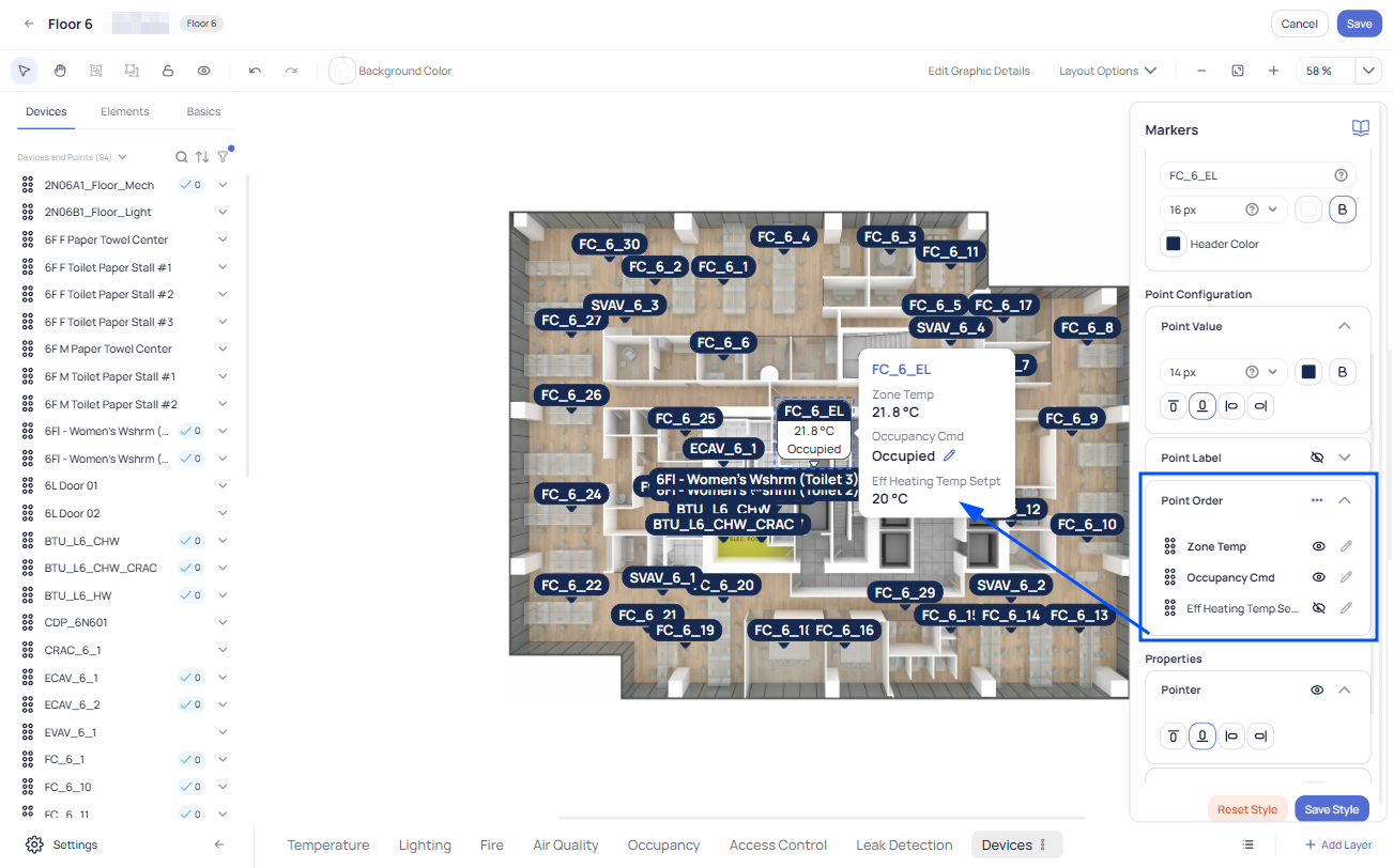
Selecting Points for Display and “Hover-Over” on Markers
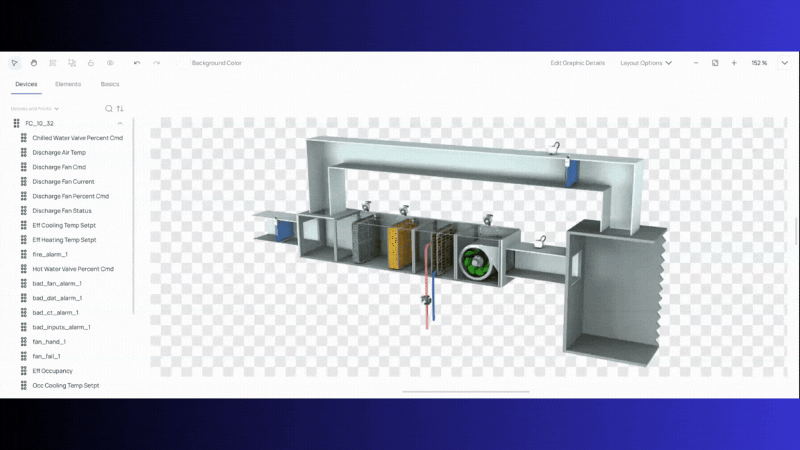
To select which point(s) will be available on the selected marker,right click on the marker, go to “Edit Points”, and select the point(s) you want to be associated with that marker:
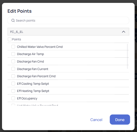
After that the marker will change its appearance to show the points selected:
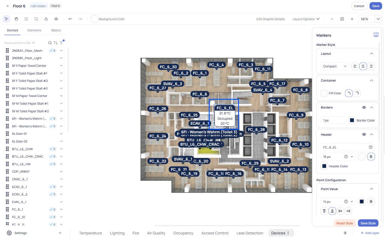
While you have a marker selected, you can explore the right-hand menu panel to customize its appearance and behavior. Here you can control fonts, colors, borders and other attributes. You can also arrange the order in which points are displayed. If you want to display the marker(s) in a more minimalistic way, you can enable the feature called Hover-over Markers. Just “hide” the points that you don’t want to be displayed as default, and when a user hovers over the marker with their cursor the other point values will be shown:
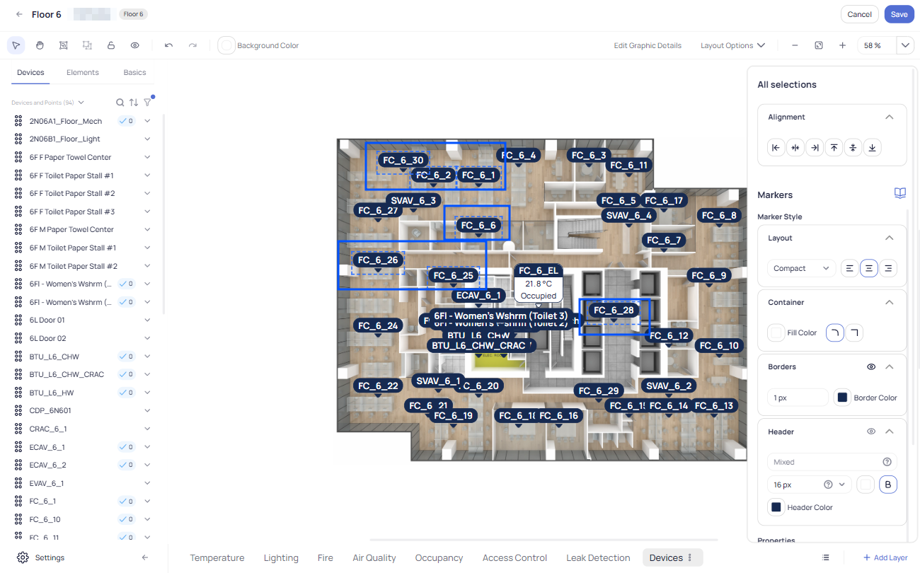
Batch edit/update
If you have a lot of markers in your floor plan, the Batch edit/update feature in the KODE OS Graphics module l can be very useful. Select a group of markers by using the (pressing) SHIFT key and clicking on the desired markers, or simply click and drag with a mouse and the markers in that region will be selected. Now any changes made on the right-hand menu will affect all the selected markers:
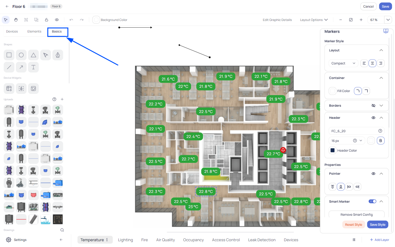
Smart Markers
You can also activate the Smart Marker feature while on a selected marker (or group of markers that are selected now using multi-select option). This feature is enabled on the right-hand menu at “Smart Marker”.
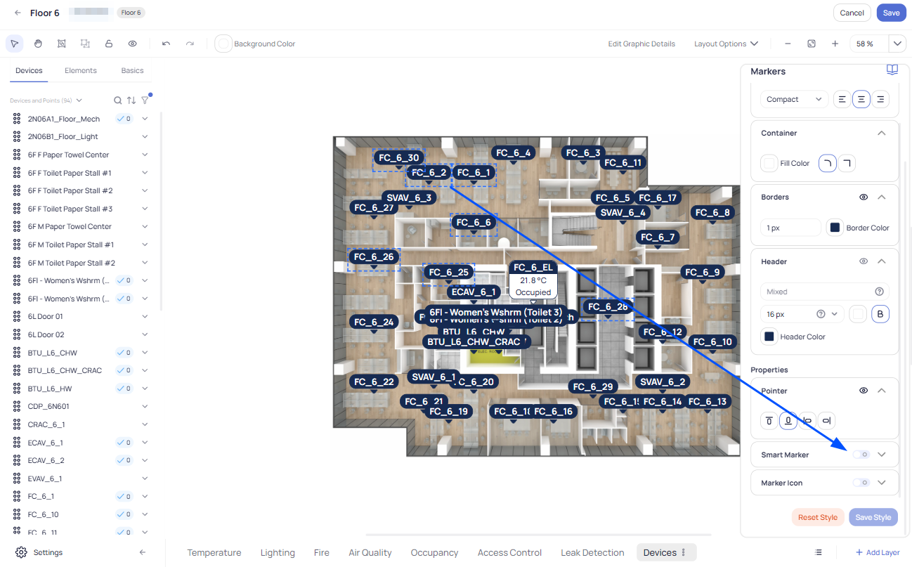
After enabling this feature you need to select the Point under Ontology Type where the smart marker will respond. In this case we have selected the “Zone Temperature” point, and after that we also associate the Icon Set for the Smart Marker to interact with based on the values of the point.
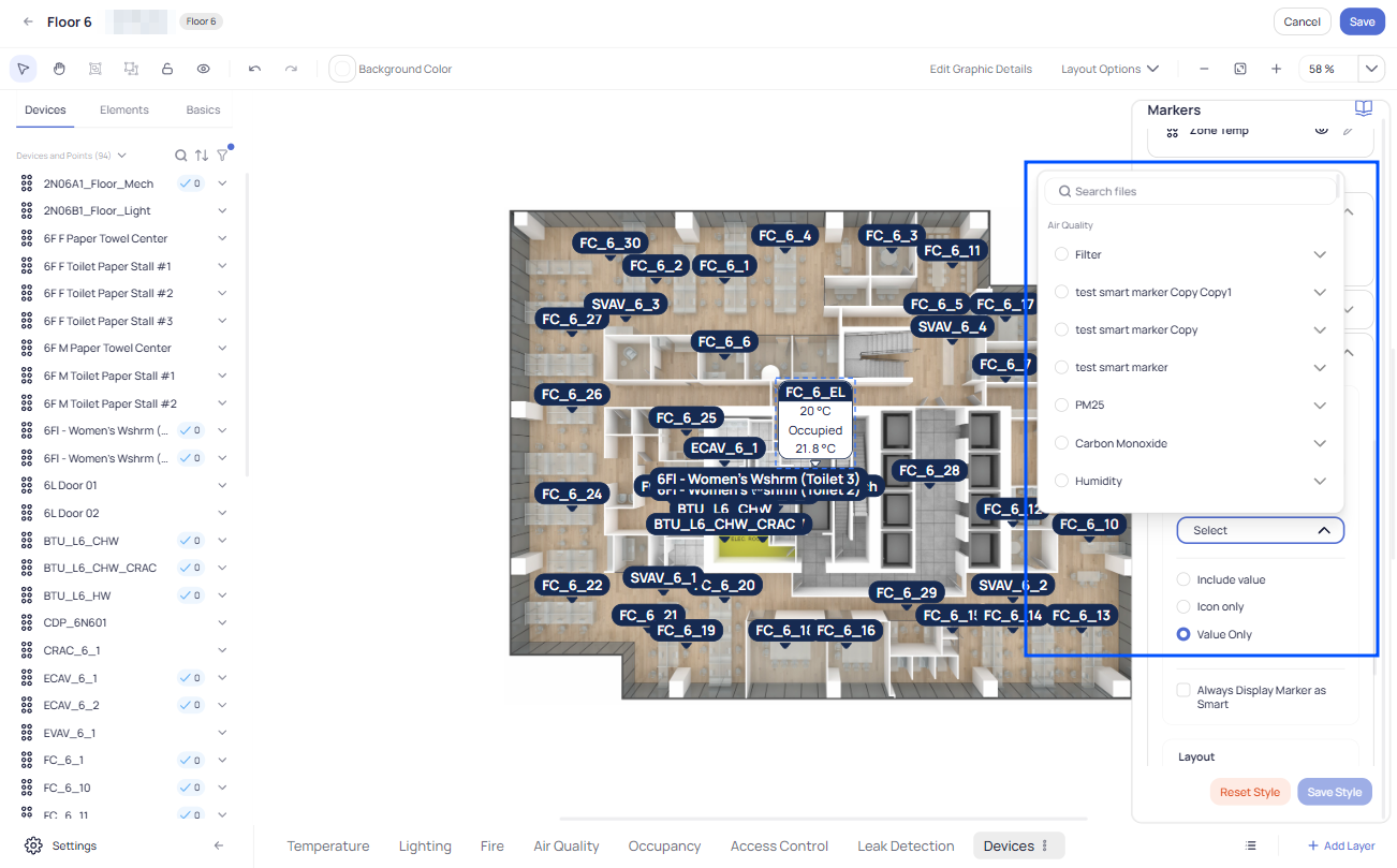
As you can see in the example above, the marker appearance will change, and you can choose one of three styles: Include Value, Icon Only or Value Only.
You can also save this style for future use by clicking on Save Style and giving it a name on the next dialog window.
Creating new Layer
Layers are a powerful convenience feature for the user, enabling multiple different views of data to be structured for simple navigation using the layer tabs at the top of the Area graphic.
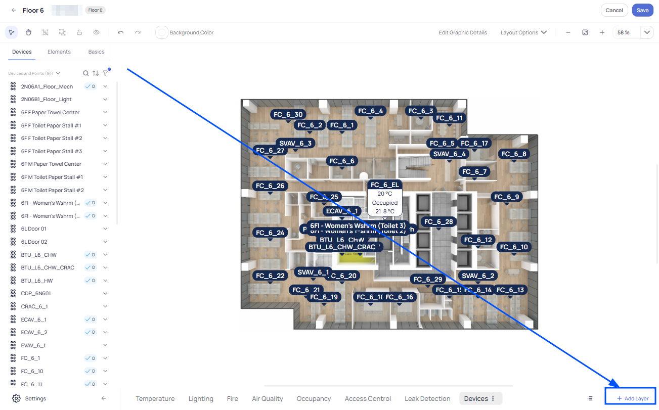
If you want to create a new layer for the floor plan, simply click on the “Add Layer” button at the bottom right corner of the graphic.
On the next window you have to give a Name for the Layer. You can also associate an Icon for the layer you are creating. One powerful feature at this step is the ability to “Import devices from another layer”. This will eliminate the need to add drag-and-drop Devices again to the floor plan. The “Import devices from another layer” process will use the positions of the Devices as they are placed in the layer from which you import them.
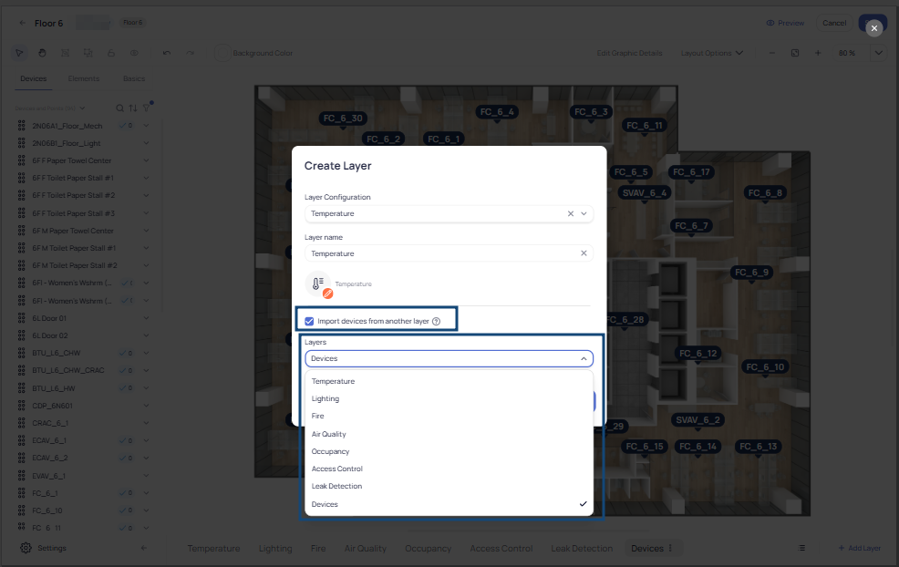
In this case you are importing Devices from the “Devices” layer you created previously, and click Done to save.
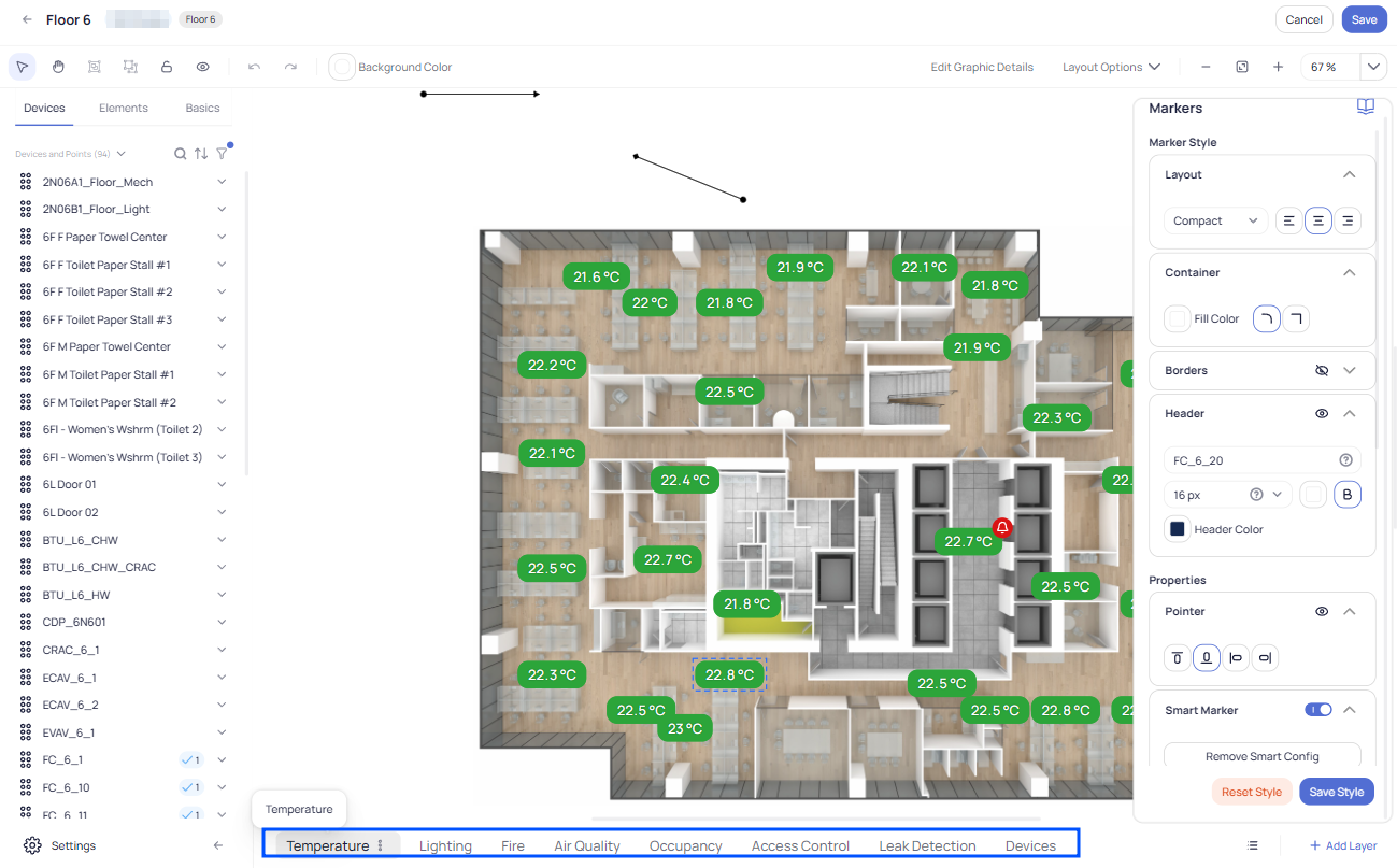
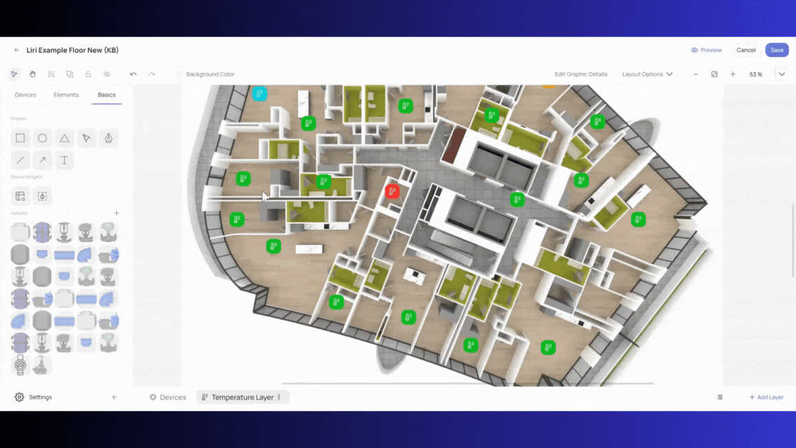
As you can see now you created a new Temperature Layer.
Note that Device positions can be changed from layer to layer if appropriate, for example if it is desired to show the Zone Temperature at the thermostat location on the Temperature layer, while showing the actual terminal units at their installed locations on the Devices layer.
Basic elements/shapes and Zones
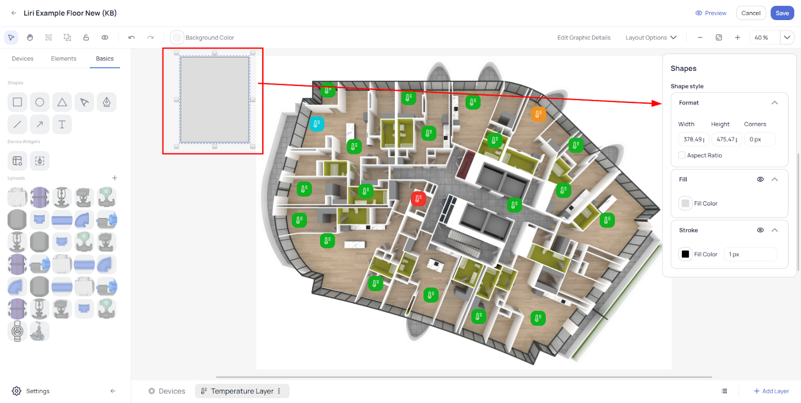
Graphics of all kinds can be annotated with various shapes and elements found in the “Basics” tab of the left-hand menu.
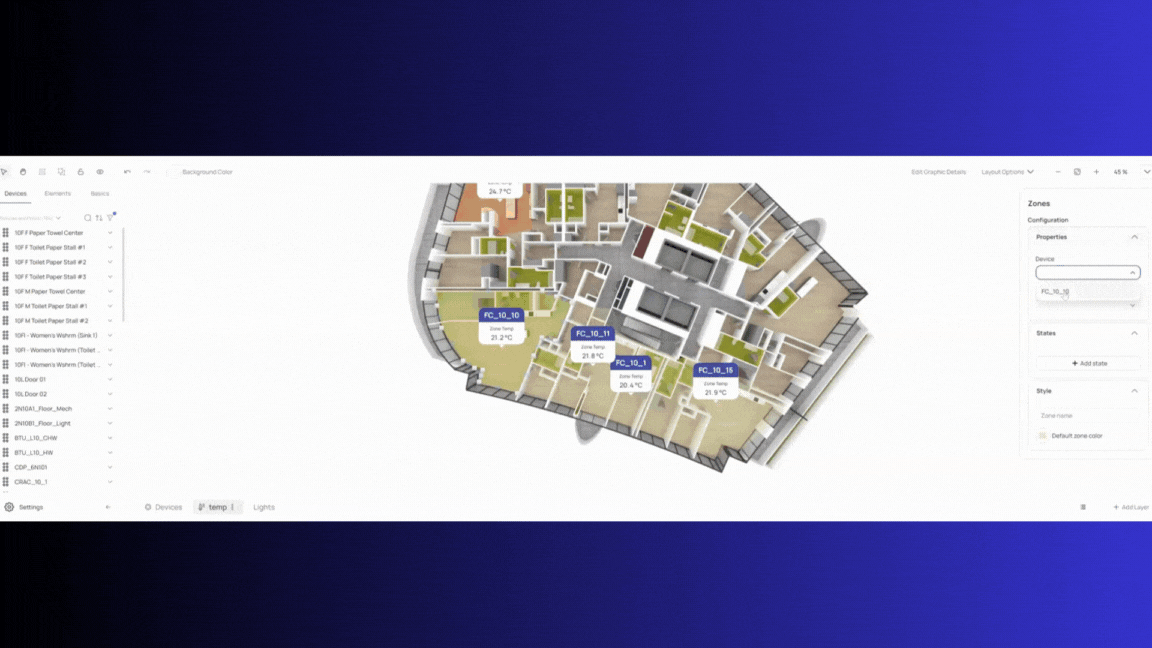
You also can draw Zones to show, for example, the portion of a floor affected by a specific device on the selected Layer, and configure States to define how Zone Color interacts with the value of the selected Device’s point.
To do that simply navigate on your left side menu to the “Basics” pane.
On this pane you will see some shapes that may be handy. Simply drag and drop them onto the graphic. Each of them has options that you can adjust based on your needs.
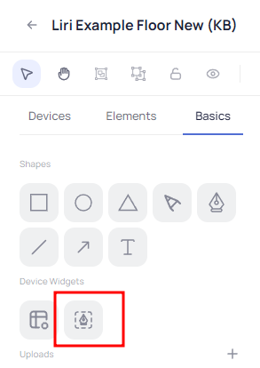
Drawing Zones
To continue with drawing Zones simply go to the Device Widgets Group and click on “Zone Tool”:
Next, you can define the shape of your Zone by clicking around the perimeter, being sure to capture all angles, corners and curves, outlining your Zone like a polygonal lasso tool.
When you have finished outlining the Zone, deselect the Zone Tool in the left-hand menu or click the ESC key on the keyboard.
After you finish drawing a Zone you can select the Zone, and on the right side the Zone Menu will appear. There you can configure which Device and Point you want the Zone to interact with. You can also set one or more States defining how or at what values you like the Zone to change color.
When you right click on a Zone, or on other Elements you added/created, an index menu will be shown where you can Duplicate, Copy to, Delete, etc. This can be very helpful when you are creating multiple layers or zones.
For example, you can duplicate this Zone and then re-shape and position it appropriately for another region of the floor plan. Then just change the Device and Point values and keep the State of the original Zone.
When you select the duplicated zone simply double click on little white squares to delete the pin of a line to match the new zone:
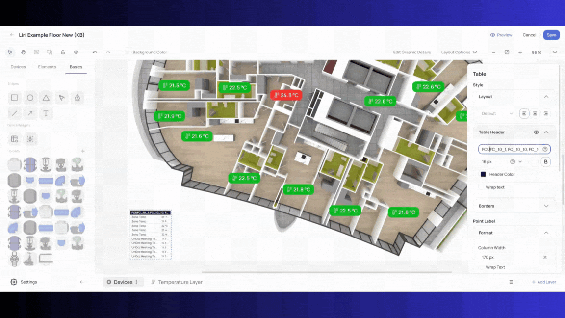
Device Tables
To add a Device Table, simply drag and drop it from the Basics menu in the left-hand menu pane:
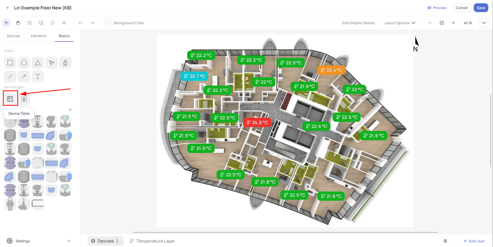
After you drop it onto your graphic, a pop up window will appear where you can select which Device(s) and which Point(s) you want to include in the table.
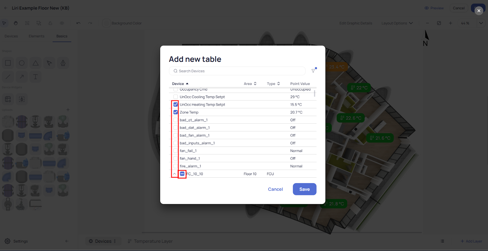
You can then select the table and customize it using the options on the right-hand menu. This menu also has an option to highlight the Setpoint:
Device Graphics
The Graphics module also has an option to create a New Device Graphic directly within the tool. You can also create Templates that can be applied to a Device in Device Details or on Device Batch Update.
Accessing the Device Graphic
To create a graphic for a device you have two ways:
You can simply go directly to the Graphics module from the main left side bar and select “Graphic Tool” and then select “New Device Graphic”.
Alternatively, from the Device Details page you can click “New Graphic View” on the lower right side of the screen
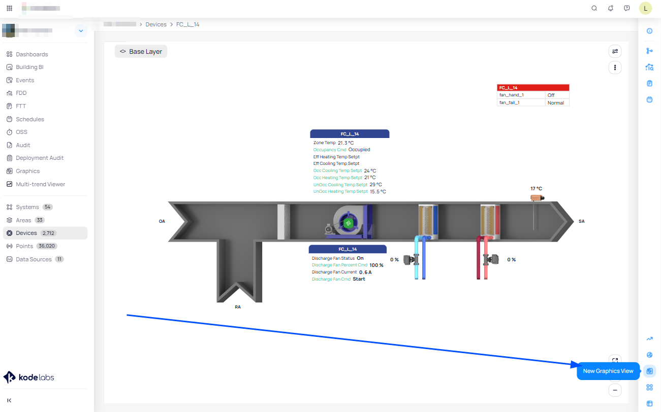
Both paths will bring you to the main dialog where the system asks you for the graphic Name
If you took the first approach, you will also need to select a Device
If you took the second approach, the Device will be assigned automatically since you went there from the Device details.
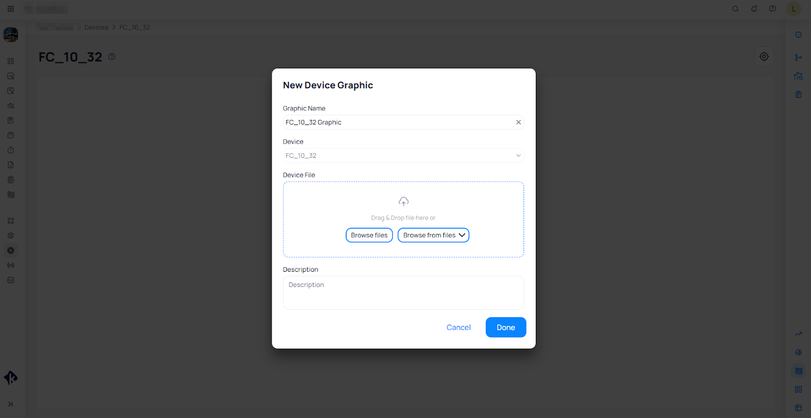
Next you need to choose a graphic file for the device you selected.
You can upload a file from your PC directly by clicking on the “Browse files”.
Or you can choose from files previously uploaded to KODE OS by clicking on “Browse from files”
Now you can edit the graphic to best reflect your Device, and to simplify monitoring and control directly from the Device Graphic.
Editing and adding points to the Device Graphic
Select available Points of the Device from the list on the left-hand side, and simply drag and drop them in the graphic where they will represent the best actual position either physically or logically.
You can customize markers as per your requirements. For more information on this please view “Article Link (Customizing Markers and Icons)”.
System Graphics
KODE OS now provides an innovative tool for creating System drawings with ease and efficiency. With this feature, users can effortlessly design intricate system graphics tailored to their needs.
Simplified System Schematics
Drag-and-Drop Library: Access a comprehensive library of pre-made drawings representing common system components like pipes, valves, pumps and more. Simply drag and drop these Elements from the Basics menu onto your workspace to build your schematic.
Modular Components: Each drawing represents a single component, allowing for easy customization and arrangement.
Visualize Your System: Build your system layout by dragging and dropping components to create a clear and concise representation.
Enhanced Usability
Grouping Functionality: Group related components together for better organization and management of complex drawings.
Additional Options: Explore further options designed to improve your workflow and make system drawing a breeze.
Besides this, you can also make edits using an existing System Graphic file similar to how it is done for Device Graphics.
Drawing a System Graphic
To draw a System using the KODE OS Graphics module, you can follow one of two paths, as is the case for Area and Device graphics.
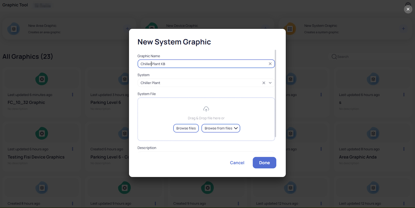
You can simply go directly to the Graphics module from the main left side menu bar. Select “Graphic Tool” and then select “New System Graphic”.
or once you are in the device details you can click “Graphic View” on the lower right side of the screen and then click the “Create New” button.
Both paths will bring you to the main dialog where the KODE platform asks you for the System Name
(If you followed the first approach, you will need to select a System
If you follow the second approach, the System will be assigned automatically since you went there from the System record.
To continue assembling your System graphic, navigate to the “Basics” pane and under the “Uploads” section you will find different component parts already included within Graphic Tool which can be used to draw the System:
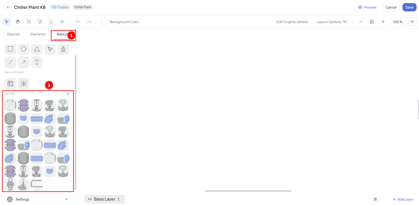
Simply choose the part, then drag and drop it on the work area.
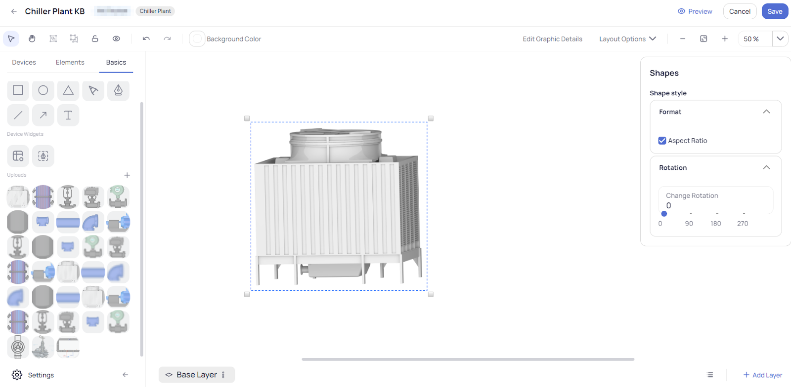
While the part is selected you can resize it and also rotate it according to your needs.
Continue placing and resizing components to assemble an accurate representation of your System.
As components are placed and sized on the work area, you can select different elements and group them by right clicking with the mouse to create a sub-assembly in the graphic. This group can then be moved and rotated more easily and in a more organized way.
Editing and adding points to the System Graphic
After you finish drawing a System Graphic (or choose one available), you can add different Markers and Icons to it for a better monitoring and control of the System directly from the graphic view.
To do this, simply choose a System and open it with the “Graphic Tool”.
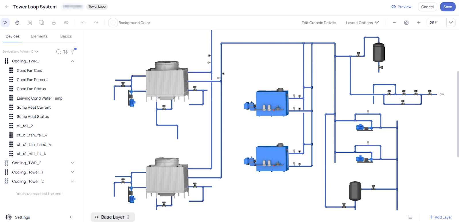
From the Devices tab of the left side menu, just like when working with Device Graphics, simply drag and drop the desired Points to the corresponding place on the System Graphic.
Customize the style and behavior per your needs.
For more information on this please view “Article Link (Customizing Markers and Icons).
Graphic Tool Settings
In the settings of Graphic Tools (Global Configuration) you can find everything that is needed to configure like Layers, Smart Markers, Icons and also here you can upload different graphic files for floor plans, devices and systems to use later while you create new graphics.
Accessing Settings
To get into Graphic Tool Settings first you need to navigate to “Graphic Tool” by clicking on the module on the main left pane on KODE OS:
When you are within the Graphic Tool in the upper right corner click on the gear icon:
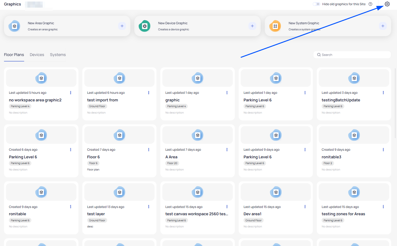
Here you find yourself within the settings page where you can upload files for Layers, Smart Markers, Icons and also preconfigure them.
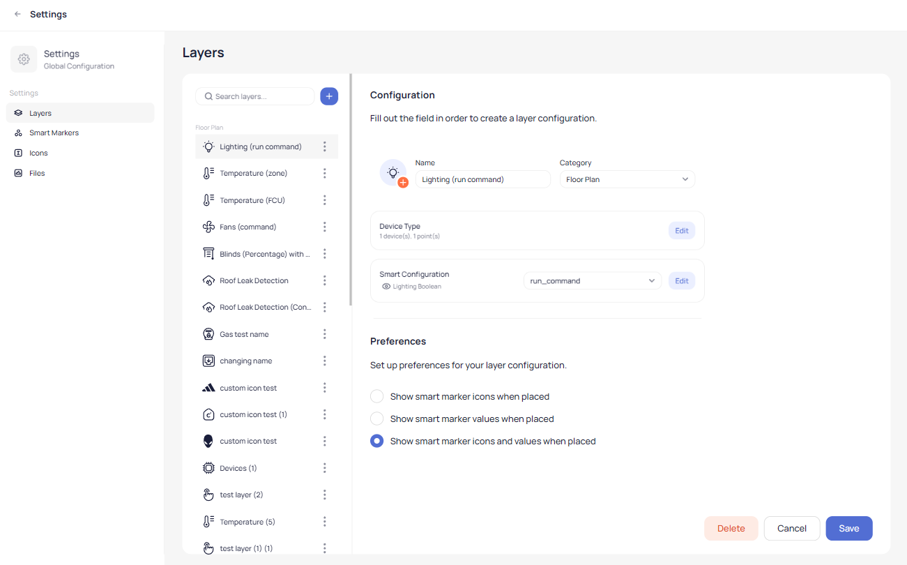
Layer Settings
In the layers settings you can configure the behavior of a specific layer according to its type.
For example if you want to have a temperature layer created first you select Layers option on the left pane:
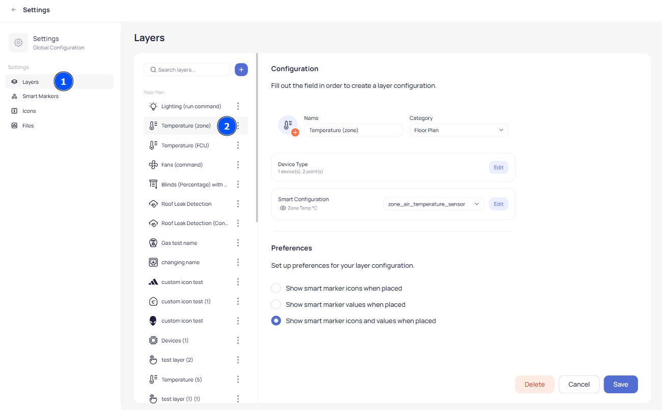
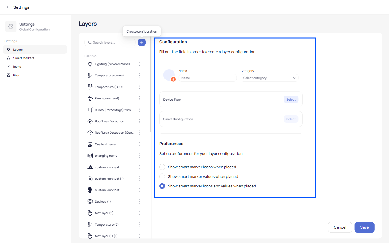
After you select the layer you can create a new layer by clicking on the blue plus button, or you can edit an existing one simply by selecting it.
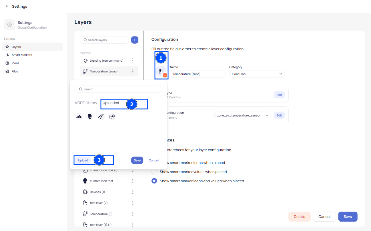
You can select an icon for your layer from KODE library or you can upload a custom icon by going on the Uploaded Icon and selecting previous uploaded one or you can upload a new one by clicking upload:
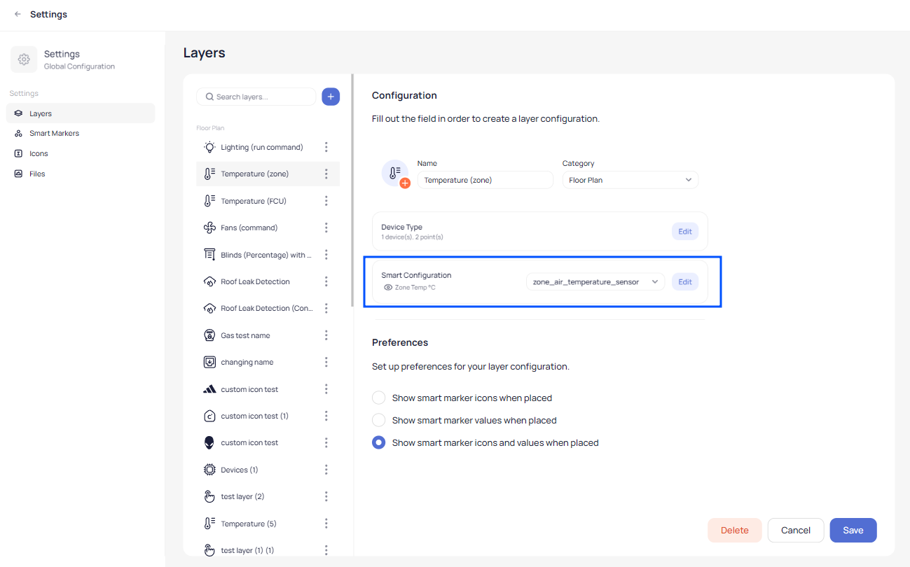
Since you selected to edit or to create a temperature layer you can select Device Type and then choose a point field. This will ease your process while you create a Floor Plan graphic which automatically adds the point to the marker when you place devices across the Floor Plan according to the layer type:
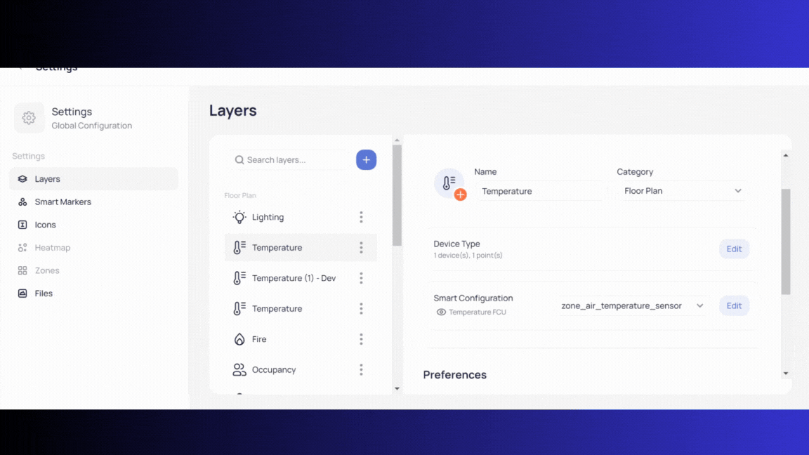
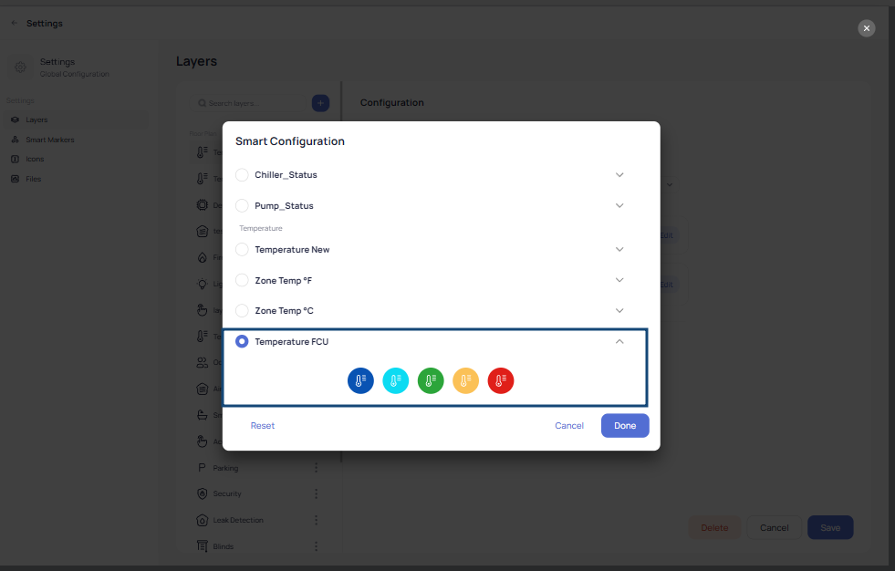
Also you can select Smart Configurator where the system will load icons according to the temperature, select the point and click on Edit:
After you click Edit select the icon configuration that correspondents with the layer type and click done:
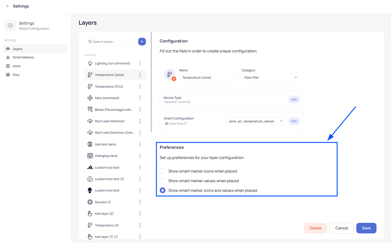
In the end you can choose the preferences on how you want to appear where listed you find these three options:
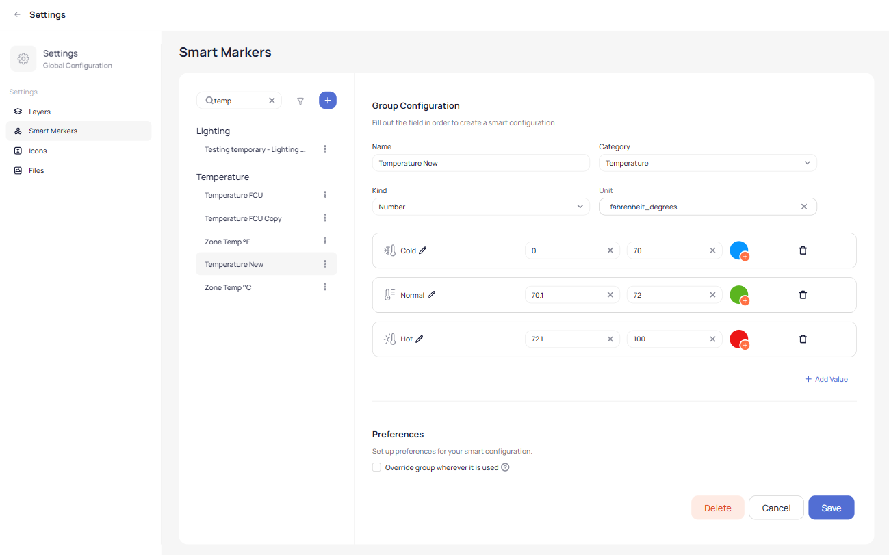
Smart Markers Settings
In the Smart markers settings you can configure or edit the behavior of the icons that will appear when you add them on any graphics.
You can find pre-configured Smart Markers in our library based on the most use cases or you can create a new one.
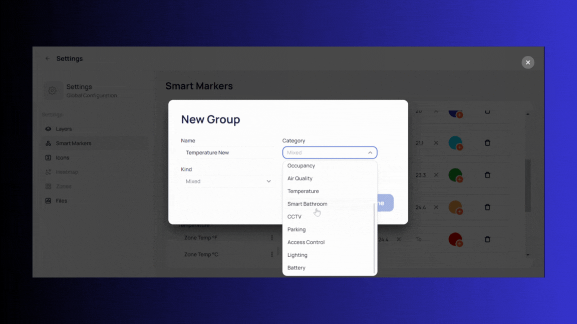
To create a new Smart Marker simply click on the plus icon in the smart markers listing and fill the name, select category and the kind if the values are Number or String/Boolean:
Then fill the values/ranges from where the smart icon will interact by clicking “Add value”:
After you complete values click done and you will be redirected to just created or selected Smart Marker windows where you can review it or edit. To finalize the work you click on the Save button:
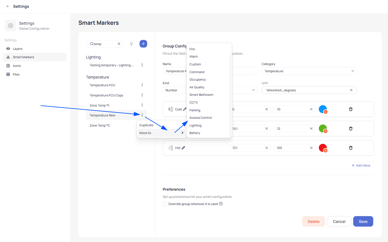
On the left side where all Smart Markers are listed you can click on the three dots of the Smart Marker you want and there will be shown two options that gives you the ability to Duplicate it or to move it to another Category:
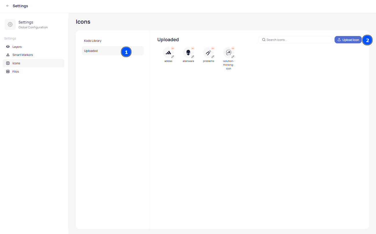
Icons Settings
In Icons settings you can view our library of icons or you can upload custom ones.
To upload a custom Icon click on “Uploaded” and then click the “Upload Icon” button:
After you click the button the upload window will appear requiring you to input the name for the icon and to browse the icon file (file should be in svg or png format not exceeding 2MB):
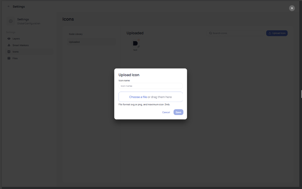
After naming the icon and selecting a file simply click Save and your custom Icon will be available to use and select in the graphic tool.
Files settings
In Files Settings you can browse your uploaded graphic files that you are using in Floor-Plans, Devices and Systems. Files are also categorized here in: Floor-Plans, Devices and Systems.
You can upload files within each category for a later use while you will be creating any graphic.
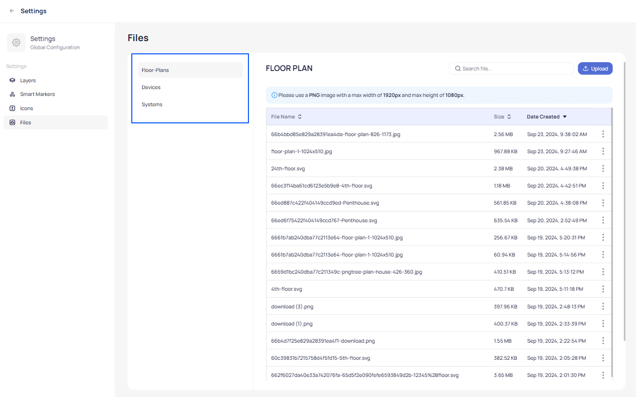
Recommended file format is PNG with max width of 1920px and max height of 1080px.
On each file you can click on the three dots to open a specific option menu:
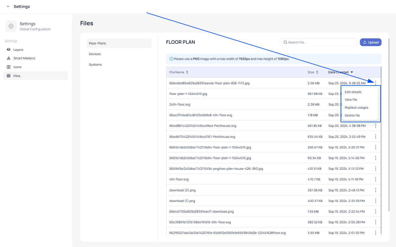
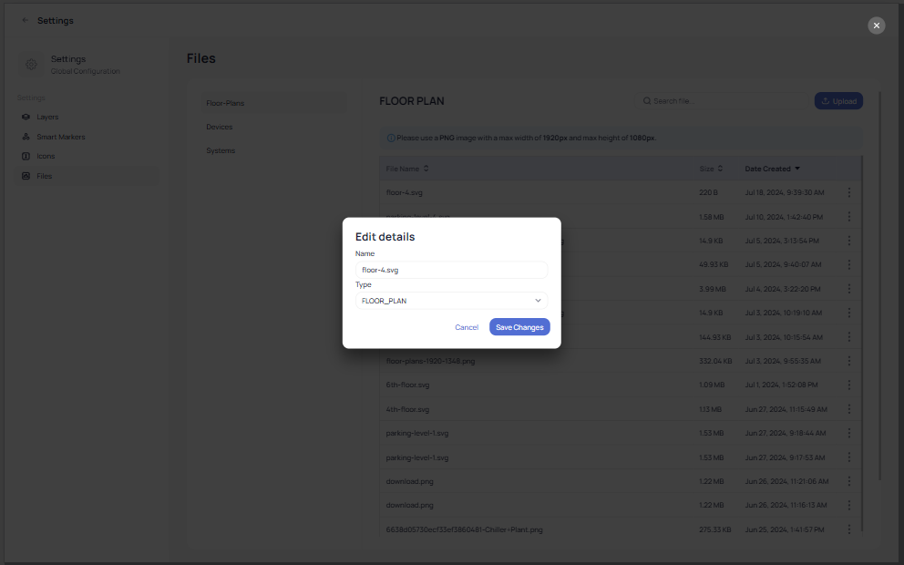
In “Edit details” you can change the name of the file and it’s type:
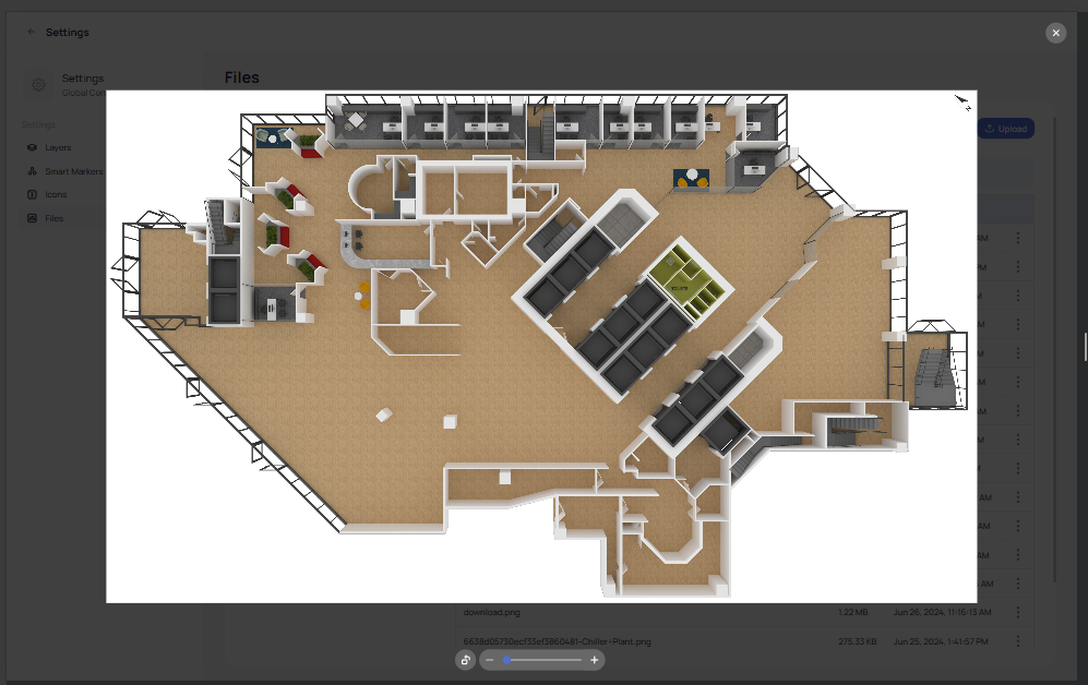
In “View file” you will be able to view a file and rotate it:
In “Replace usages” you can replace the image file with another file of your choice and the Graphic Tool will replace the image file everywhere where it is being used.
In “Delete file” you can delete a specific file if you do not need it anymore to be in the Graphic Tool.
Related Articles
Floor Plan & System Graphics
Placing devices into floor plans The goal of floor plan placement is to put each of the equipment in its intended location in the building for quick and easy viewing. Follow the below steps for further instructions. Navigate to a building of your ...Deployment Audit
As your building is integrated into KODE OS, the feature in our platform “Deployment Audit” will offer insights into the integration process by defining which systems and devices have been successfully integrated and which are in the process. The ...Systems
Systems Options and Features In order to obtain a visual representation of device placement throughout major systems and interact with the devices directly, you can rely on the Systems module. Select the building of your choice by clicking “Sites” on ...Devices
Accessing Devices To access Devices just click on devices on the left pane after you selected the desired building. Here you can see a list with all devices that are available in the selected building. You can perform a search to narrow the list to ...Site Dashboards
You can customize the Dashboards to suit your preferences, allowing you to add various widgets for quick access to the information you need, all from a single view. Below, you’ll find instructions on how to add and modify some of the most commonly ...