Energy Dashboard
Depending on your user privileges as well as company subscription, you may be given access to an additional module called Energy Dashboard which shows data for energy consumption (inclusive of power, water, steam, gas, etc.) at the building level as well as the sub-meter level.
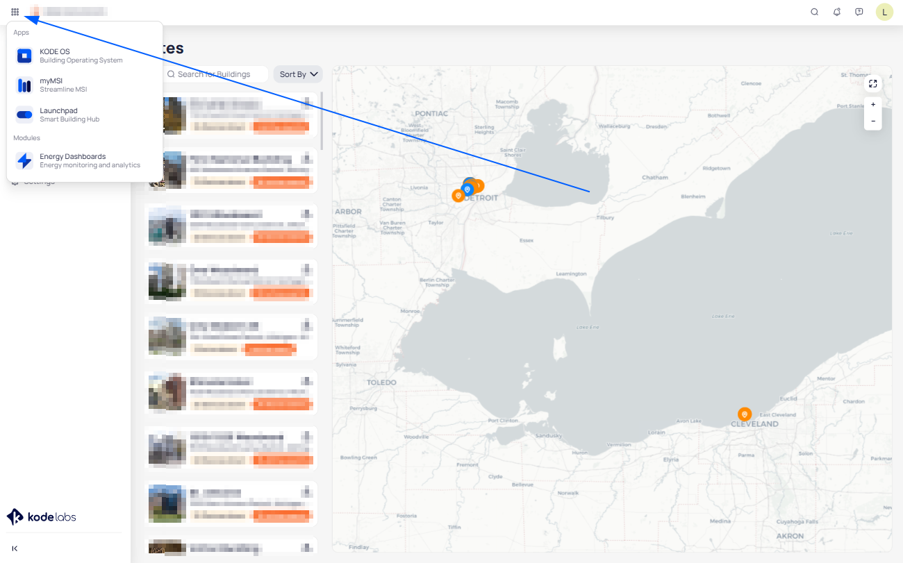
Navigating to the Energy Dashboard is done through the quadrant icon on the left hand navigation bar. Selecting it will give you the option to switch to Energy Dashboard or any other KODE OS Product that you have access to at any time.
Navigating Through the Energy Dashboard
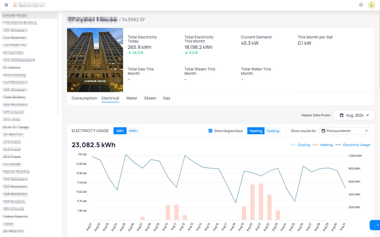
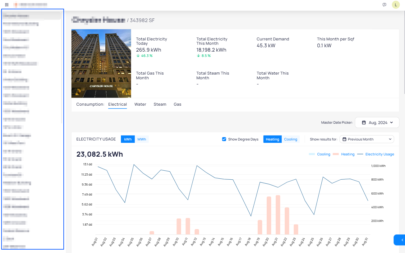
On the left hand sidebar you can select the building which will be shown in the Energy Dashboard.
Click on the arrow on the lower right hand corner which will allow you to select an individual meter of the building and view its energy performance.

The top part displays the building name, total square footage, and cumulative energy performance data for all types of energy that are integrated in KODE OS. If you would like to only see the same performance data for one type of energy, you can filter the data on the lower part of the section.
Below you can see a Master Date Picker which will apply the selected date(s) to all of the charts below.
Energy Usage
The second portion of the Energy Dashboard shows Energy Usage for the selected building. Here we can see energy usage for heating and cooling days in conjunction with degree days.
Consumption can be further broken down into individual Site Meters and Sub Meters.
The time period for which the energy usage is shown can be changed by the selector in the upper right hand corner.
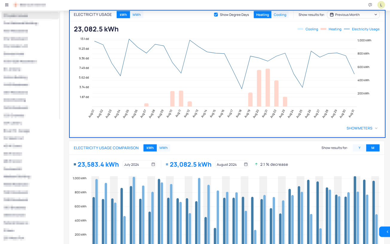
Energy Usage Comparison
The third portion of the Energy Dashboard is used to compare energy usage between two time periods.
The time periods can be selected on the top part of the section along with the toggles for kWh/MWh and Month/Year.
Depending on the selection, the bar charts will show energy performance for both selected time periods along with a percentage indicating overall energy usage increase or decrease in the upper right side.
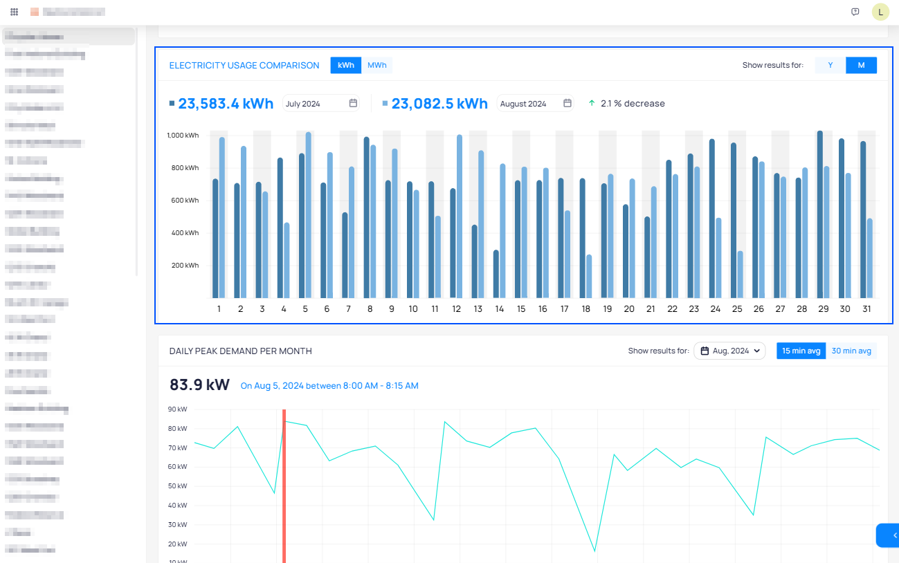
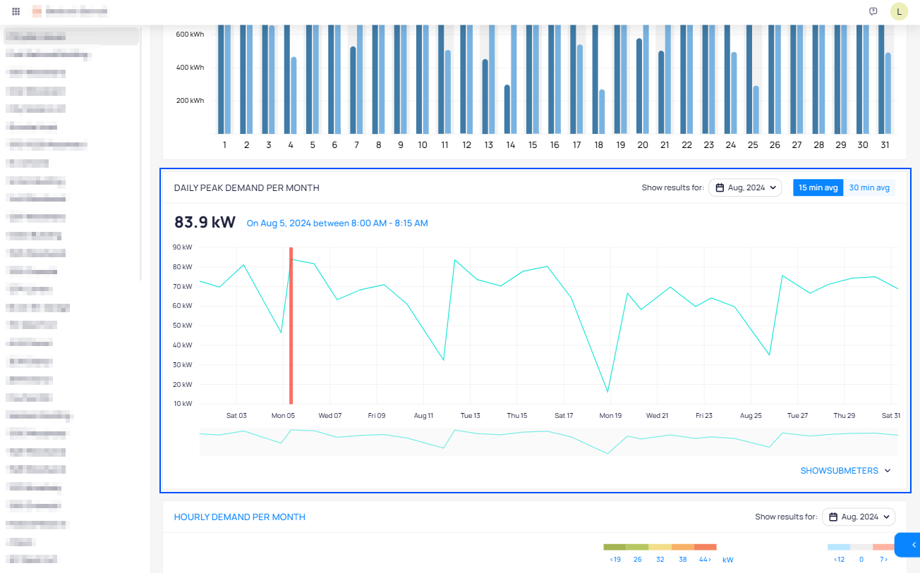
Daily Peak Demand per Month
The fourth portion of the Energy Dashboard shows Daily Peak Demand per Month which shows the highest consumption point of energy per month.
The date will be inherited by the master picker but can also be set individually. The peak demand can be shown for 15 and 30 minute averages.
The vertical red line on the chart signifies the highest consumption peak of the month.
Selecting Show Submeters will show all submeters in the chart and in a table view displaying their individual contribution in reaching the peak demand in kW and in percentage values.
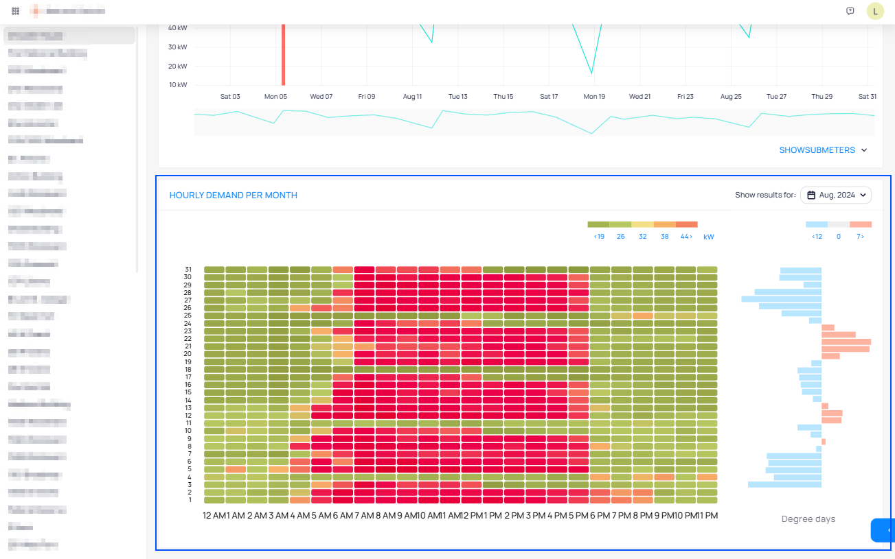
Hourly Demand per Month (Heat Map)
The fifth and final portion of the Energy Dashboard visually displays Hourly Demand per Month via a heat map.
The green areas indicate lower consumption, orange indicates medium consumption, and red indicates high consumption.
The included legend shows the exact separation in kWh.
Horizontally, each line displays a day as indicated by the date on the left side whereas vertically each quadrant represents one hour of the day.
Hovering on a quadrant with the mouse will show the exact registered consumption for the hour.
Degree Days
On the right side of the heat map, there is an additional visualization of degree days which are associated with each day of the month.
The visualization does not only display the type of degree day but also its intensity.
Related Articles
Event Streaming
The FDD Streaming View provides the classical interface for monitoring building notifications along with a number of preference settings to adjust the view to the needs of the portfolio or user. Highlights Automatic Refresh Streaming comes with an ...Events Options and Features
KODE OS monitors the operational health of your equipment 24/7 via event routines which cover everything from fan command failures to zone temperature off setpoints. The Events Dashboard is the central location in KODE OS through which you can view ...Building BI - Data Sources
Building BI - Data Sources In order for Building BI to calculate and display data, it needs a Data Source. This is where all metrics, calculations, and columns originate from. Because of this, the Data Source section exists to define what data ...Customize Event Dashboard
You can customize the Event Dashboard to your liking in Settings by clicking the More icon. Customize the Event Dashboard by clicking the More icon on the bottom right of your screen. Click on Customization under the Settings section. An edit view of ...Introduction to the OSS Dashboard
This dashboard is essential for monitoring and ensuring the devices configured with OSS are performing as expected. It enables you to filter information based on date time, areas, schedules. Moreover, it allows you to track changes over time, ...