Building BI - Navigation
The Building BI tool is a feature within our platform that allows you to view data on a dashboard and in a chart form. This data can provide valuable insights into the performance of your building management solution, helping you make informed decisions about how to optimize and improve your operations. Building BI makes it easy to view and analyze your data.
Navigate to Building BI
To access Building BI, you'll first need to log into your account in KODE OS. Once you're logged in, look for the "Building BI'' module on the left main navigation bar. Click on this module to open the Building BI.
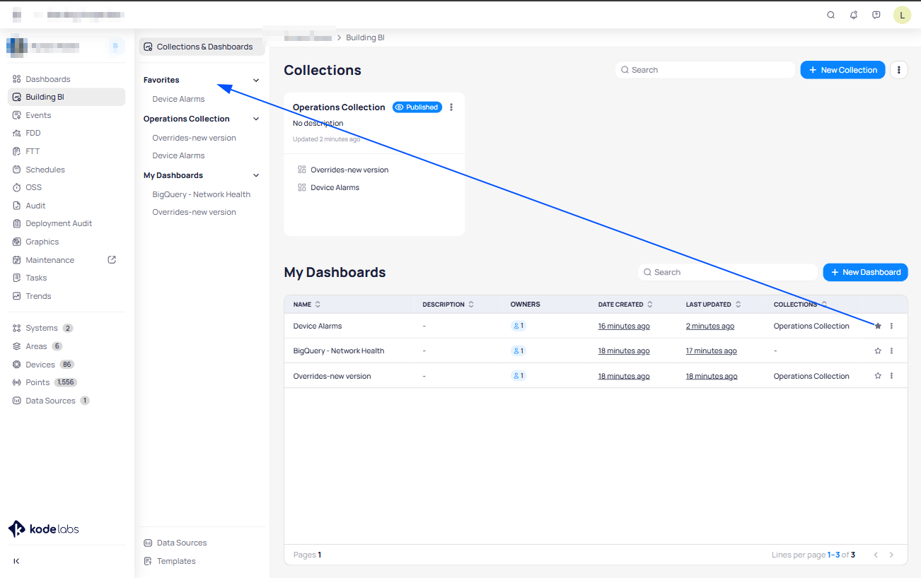
Once you are in the Building BI module, the view is separated into Collections & Dashboards:
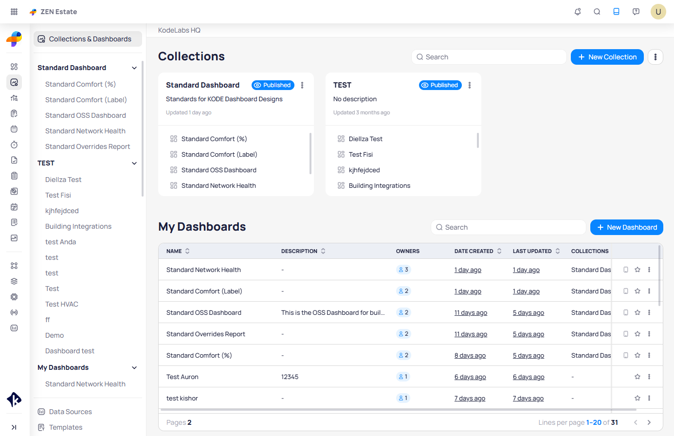
Under “My Dashboards” view, you will find all the BBI dashboards that you created or the ones where you are added as a collaborator. In the collections, you will find the BBI dashboards organized within them, and they can later be shared with all roles or specific ones.
Create a new Dashboard
Adding a new dashboard to the Building BI tool is a great way to customize your view of the data and focus on specific metrics or data points. Here's how to add a new dashboard:
Click on the "Building BI" module located in the main left navigation bar to open the tool.
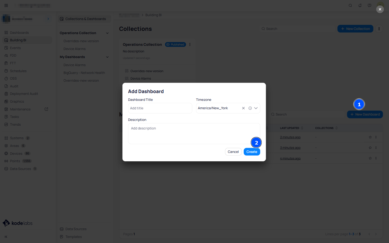
Click on the "+ New Dashboard" button located in the middle right of the page.
Give your new dashboard a name and a description.
Click "Create" to save your new dashboard.
Add Widget/Charts to the Dashboard
Here's how to add charts to your dashboard:
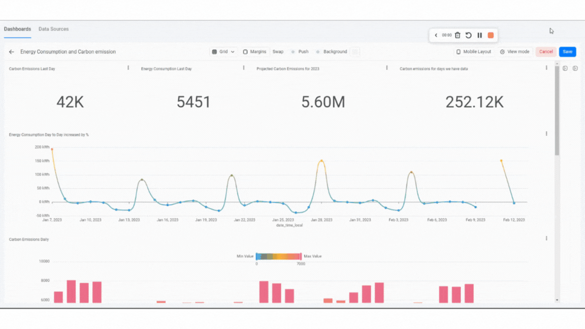
From the dashboards list, select the dashboard you want to populate with charts.
Click on the "Edit Dashboard" button located at the top right of the dashboard.
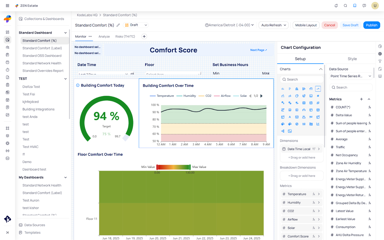
Click on the side menu to open up the Chart Configuration menu.
Select the chart type you want to add to the dashboard (e.g., line, bar, pie) by dragging the
chart to the dashboard or double-clicking on it.
Select the data point you want to display on the chart by using the dropdown menu of the Data Source field.
Once the data source is selected, a list of metrics and data points will be displayed.
Drag to the “Setup” section the data points you want to display on the chart.
Customize the chart by selecting different options, such as the chart title, chart colors, and chart size.
You can customize the position of the chart on the dashboard by clicking and dragging it to a different location.
Clicking on the 3 dots icon located at the top right of each chart, you can duplicate or delete the chart.
Repeat these steps to add additional charts to your dashboard.
Once you're satisfied with the charts and dashboard, click "Save" and you’re done.
Managing the created BBI Dashboards
You can manage all the BBI Dashboards you created or are a collaborator of, and these BBI Dashboards are listed in the section “My Dashboards”.
Here you can see the details like description, owners, data created, last updated, and the collections where a specific dashboard is added to.
You can also click on the star icon to mark the dashboard as a favorite, and once you have at least one dashboard as a favorite, the listing on the left side will be populated with the “Favorites” section:
If you click on the three-dot options of the dashboard, you will see the following options:
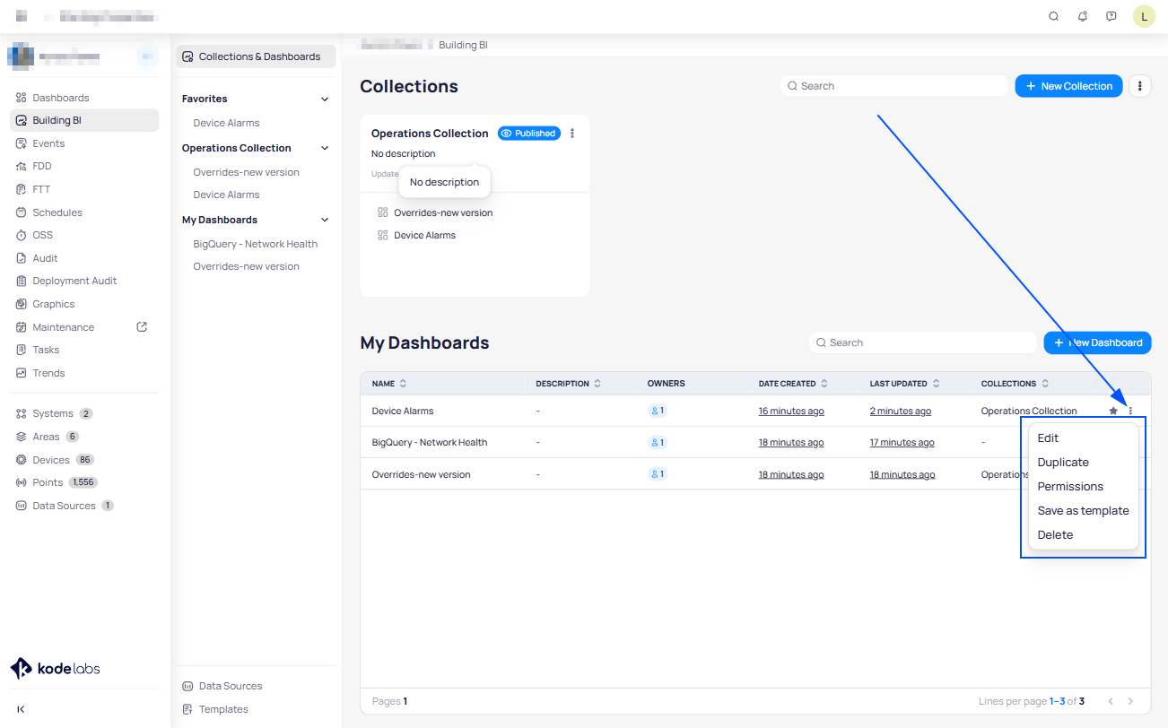
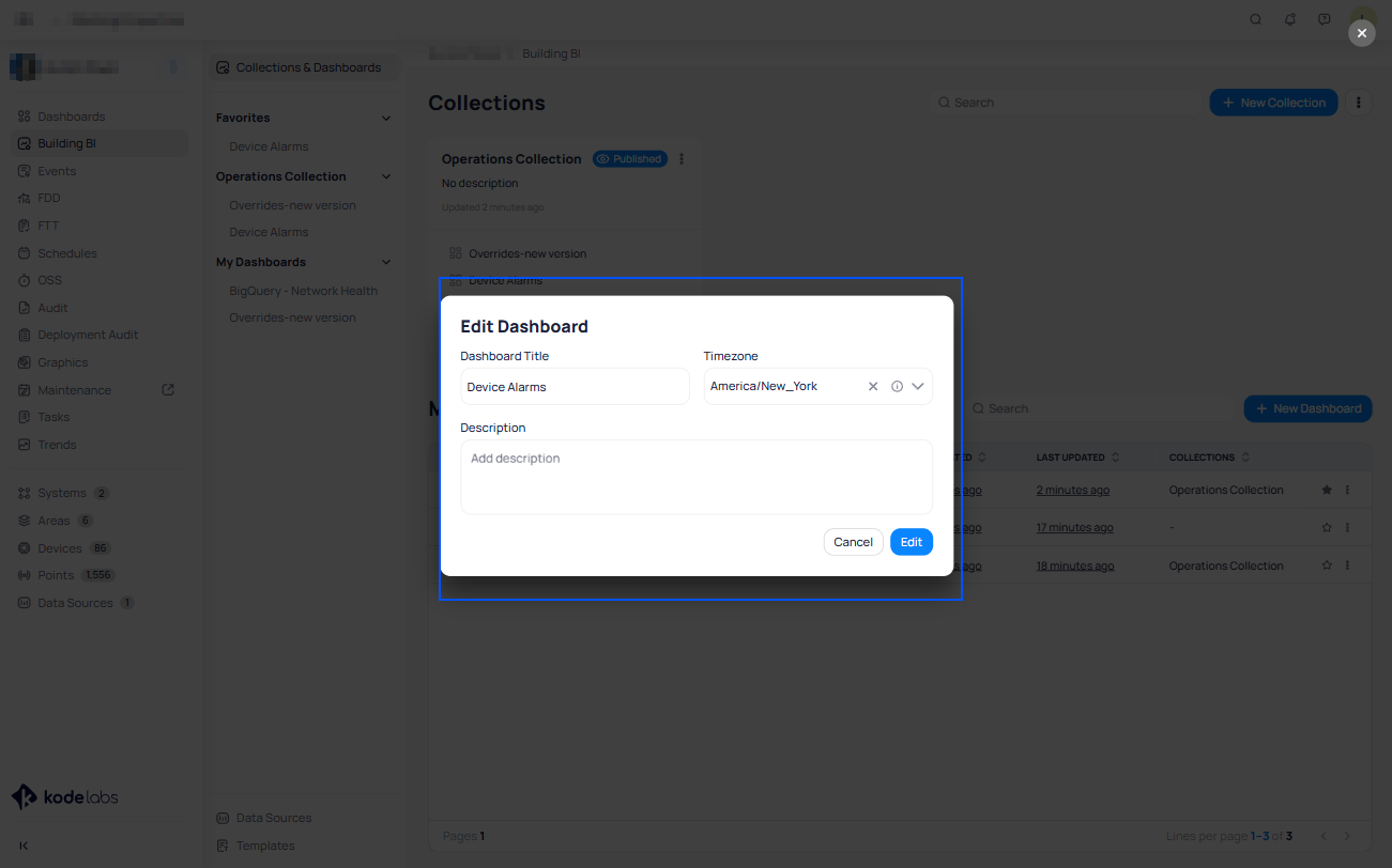
Edit - In this option, you can edit the Dashboard’s name, time zone, and description:
Duplicate - With this option, you can duplicate the dashboard
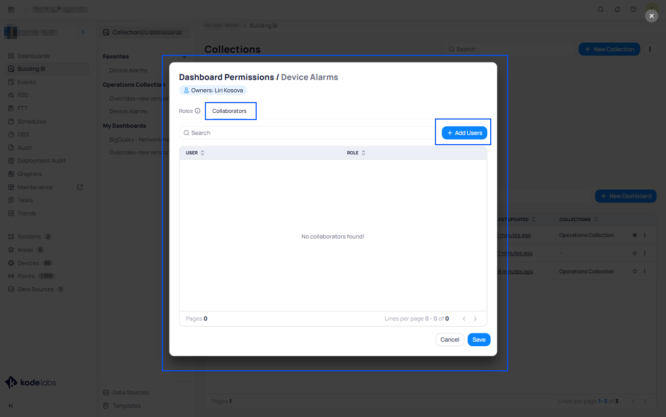
Permissions - In this option, you can add “Collaborators”. The collaborators can change and edit the dashboard. Simply click on the Add Users button, select the users you want to add as
collaborators, and click save:
Save as template - With this option, you can create a template using the existing dashboard in order to use it on another site. After clicking this option, a dialog box will show up requesting to enter
The template title and the description.
Delete - This option deletes the dashboard.
 Note: A collaborator can only be a user and not a role. Also, collaborators have full access to the dashboard but cannot remove the original owner/creator of the dashboard.Shareable Link
You can build your desired dashboards and embed them in other platforms or share them with external users.
Sharing a dashboard is easy, and here's how you can do it:
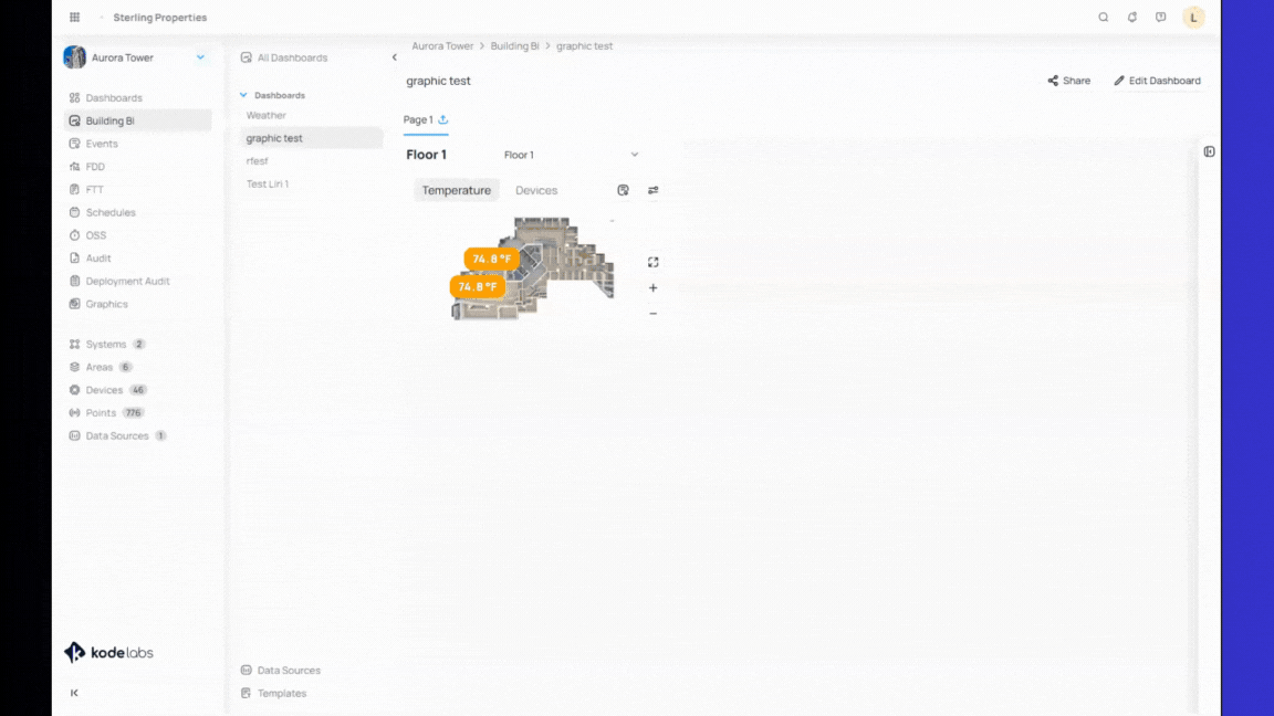
Navigate to the “Building BI” module from the left main navigation bar.
Select the dashboard of your choice.
Click on the “Share” button at the top right of the dashboard.
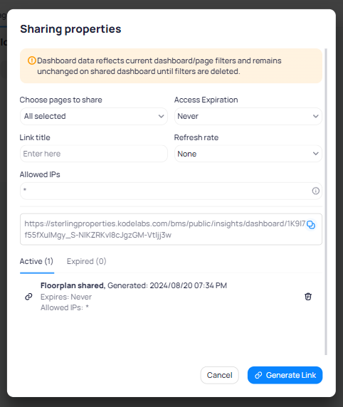
In the “Sharing properties” pop-up page, you can choose:
Pages to share,
Access expiration,
Refresh rate.
Click on the “Generate Link” button.
Copy the shareable link by clicking on the Linkicon to share with external users and open
on the browser.
You can get back to the list of the created links by clicking on the Share icon button at the top
right of the dashboard.
The link is automatically enabled, which allows you to share the link immediately by copying it.
You can delete the link at any time to revoke access to the widget by clicking on the
Delete button.
Any internal users with no access to that widget, or any external users you have shared it with
The link will no longer be able to view the widget.
If you wish to generate a shareable link for a specific widget, here's how you can do it:
Click on the 3 dots icon at the top right of the widget.
From the drop-down menu, click on “Share”.
In the “Sharing properties” pop-up page, you can choose:
Choose pages to share
Access expiration,
Link title
Refresh rate.
Allowed IPs
Click on the “Generate Link” button.
Copy the shareable link by clicking on the Linkicon to share with external users and
Open in the browser.
Adjusting the BI Dashboard to Fit Smaller Screens
When adjusting your browser window, such as snapping it to one side, you might notice layout or resizing issues within your BI dashboard. To maintain a consistent and user-friendly layout, we recommend switching to a Fixed Canvas.
Here’s how to adjust the canvas settings:
Click Edit Dashboard at the top of the screen.
On the right-hand panel, open Dashboard Options.
Change the canvas type to Fixed.
If you're using a smaller screen, manually set the width (e.g., 1500 px) to ensure proper fit.
Click the Publish icon in the top-right corner.
Confirm your changes by selecting Yes, publish.
Using a fixed canvas ensures the dashboard layout remains stable across various screen sizes, making your BI experience more consistent and reliable.
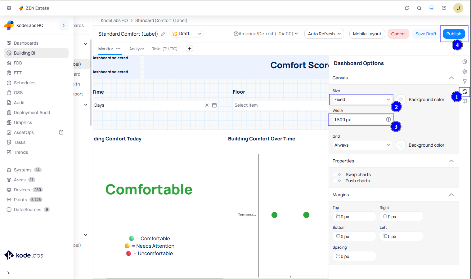
If the screen is smaller than the defined width, a scroll bar will appear, allowing users to scroll horizontally to view all the content.
Related Articles
Building BI - Widget Customization & Styling
“Set as Default Style” and “Apply Default Style" Features The "Set as Default Style" and “Apply Default Style" features allow you to quickly copy styling from one widget or chart to others within the same Building BI page. This helps maintain ...Building BI - Settings
Building BI - Settings The Settings option in Building BI allows you to view and manage: Shared Links Scheduled Reports Shared Links: In this section, you can view all links generated for specific dashboards in Building BI, including details such as ...Collections in Building BI
This feature allows you to easily organize and publish BBI Dashboards for all users or specific roles. To make a BBI Dashboard visible to users beyond the collaborators, it must be added to a collection and then published. Creating a BBI Collection ...Using BBI Templates in KODE OS
BBI Templates in KODE OS allow you to save and reuse dashboards, collections, and individual charts, helping you streamline your workflow and avoid building everything from scratch. With this template system, templates follow a clean hierarchy: KODE ...Building BI - Data Sources
Building BI - Data Sources In order for Building BI to calculate and display data, it needs a Data Source. This is where all metrics, calculations, and columns originate from. Because of this, the Data Source section exists to define what data ...